Introduction
Happy New Year! I’m excited to be back for yet another year of Workout Wednesday. This year we’ve expanded the team and made a commitment to the community to provide solution videos. We’ve also got some great collaborations lined up, and a few exciting enhancements to come (custom color palette anyone?)!
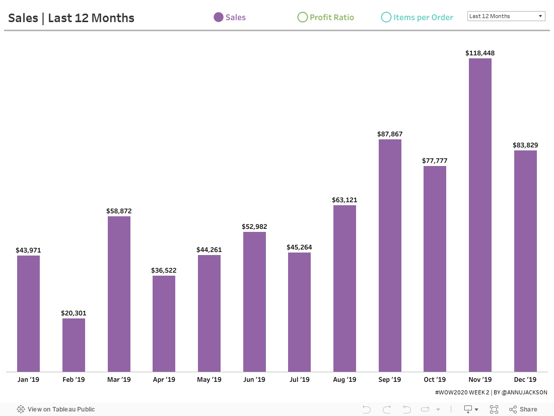
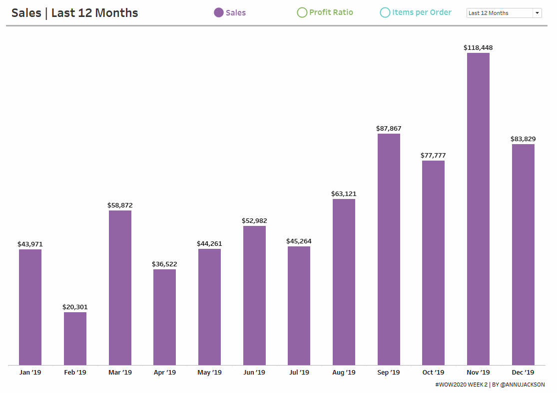
To get the year started off right, I thought we could focus on an essential – building beautiful and dynamic bar charts. Bar charts are likely the number one chart you’re making in your daily data viz life. They’re easy to understand, useful in comparing information, and can be scaled large and small and still look good.
While this is only a bar chart, don’t think I’ve gone too easy on you. This bar chart includes an interactive way to change between metrics – and perfect formatting for different number types. In fact, I’d bet you’ve likely been asked to build some variation (or parts) of the final product.
We’re focusing on three major components today:
- Dynamically changing metrics
- Dynamically changing date ranges
- Precision formatting for maximum understanding
As with many of my challenges, the devil is in the details – so I’ll be paying extra close attention to the final products to ensure you’ve mastered everything.
Requirements
- Dashboard Size: 1100px by 800 px
- # of Sheets – up to you
- Create a bar chart that switches between 3 metrics
- Sales
- Profit Ratio
- Items per Order (Quantity/Orders)
- Bar chart must switch between 3 time ranges
- Last 12 months
- Last 13 weeks
- Last 14 days
- Since the data only goes through 12/31/2019, you can use a parameter to set a fixed “Today” date of 1/1/2020
- Formatting
- Match the headers for the dates
- Month: Short Month and Year
- Week: Week and number
- Day: mm/dd
- Match the labels for the metrics
- Sales – this should be expressed as currency, with no decimals. Commas should show up for thousands, millions, etc.
- Profit Ratio – Percentage with one decimal
- Items per Order – Decimal number, with one decimal
- Use RegEx for formatting the numbers!
- Finishing Elements
- Create a dynamic button system that changes based on metric selection
- Match colors (more official palette to come, for now you get hex codes)
- Sales: #9264a5
- Profit Ratio: #86b35e
- Items per Order: #63ccc6
- Match tooltips, which are pretty simple
- Match the headers for the dates
A small hint: you can choose to use another data set for some elements if needed or preferred. I was able to accomplish this with Superstore, but it does involve being creative.
Dataset
This week uses the superstore dataset for Tableau 2019.4. You can get it here at data.world
Attribute
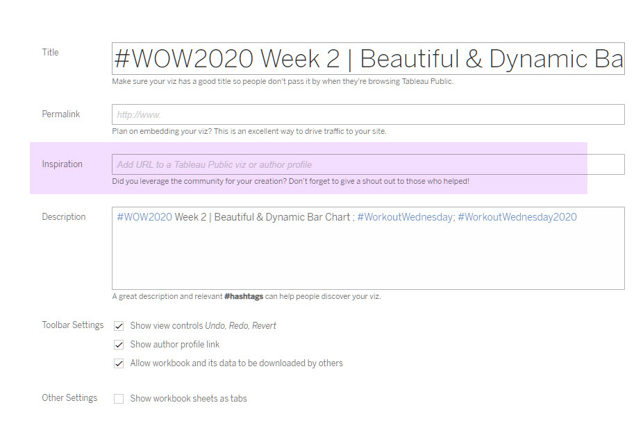
When you publish your solution on Tableau Public make sure to take the time and include a link to the original inspiration. Also include the hashtag #WOW2020 in your description to make it searchable!
Share
After you finish your workout, share on Twitter using the hashtag #WOW2020 and tag @AnnUJackson, @LukeStanke, @lorna_eden, and @HipsterVizNinja
Solution
Interactive