Introduction
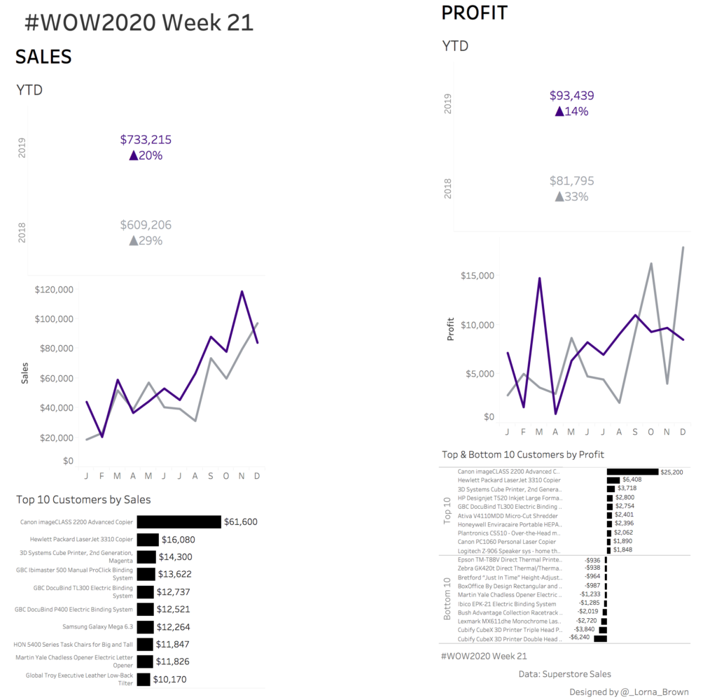
Creating the perfect dashboard requires time and patience, do we put the same amount of effort into creating dashboards ready made for mobile. This weeks shows how best to build a desktop dashboard for the automatic mobile layout. As mentioned by Bridget Cogley. Tableau’s automatic phone layout follows the a-z pattern. So top left at the top, followed by whatever is next to it. If you have time this week, play around with how you THINK Tableau should do the automatic phone layouts and see how it goes. This week also has a throwback to some normal standard sets!
Enjoy!
The image below is what it should look like on Mobile!
Requirements
- Automatic Phone Layout
- Desktop 1200×800
- You should ONLY build the DEFAULT layout*
- USING SETS ONLY to create groups
- Last 2 years Sales and Profit -YTD & Trend over time
- Top 10 Customers by Sales
- Top AND Bottom 10 Customers by Profit, in one chart
- 6 Sheets MAX
*I created desktop and tablet to let people think how the default dashboard should be built
Dataset
This week uses the superstore dataset for Tableau 2019.4. You can get it here at data.world
Attribute
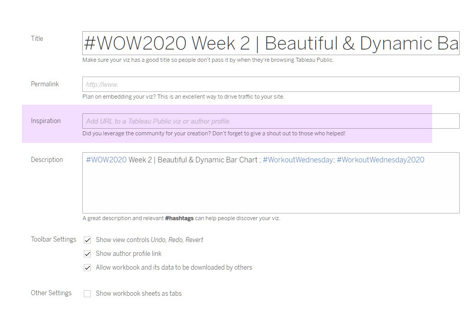
When you publish your solution on Tableau Public make sure to take the time and include a link to the original inspiration. Also include the hashtag #WOW2020 in your description to make it searchable!

Share
After you finish your workout, share on Twitter using the hashtag #WOW2020 and tag @AnnUJackson, @LukeStanke, @_Lorna_Brown and @IvettAlexa

Thanks so much for the tutorial! Very helpful!