Introduction
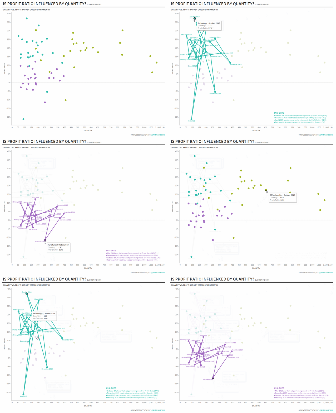
This year it seems like most of my favorite dashboards are some version of a scatterplot. I’ve always loved the scatterplot since it is such an elegant way to show two measures at once and perfect for unearthing relationships among measures. So for this week’s challenge, I thought I’d make one with a slight twist – a connected scatterplot with additional insights.
In addition to taking a scatterplot and connecting it on-demand, I’ve introduced an “insights” box. I’m sure you have all been asked at least once to make the insights from visualizations automated. And yes, there are many ways to do this, including external add-ons, but this week I’m keeping it relatively simple by having you build them into the viz itself.
Requirements
- Dashboard Size: 1200px by 1000 px
- # of Sheets – up to you
- Create a scatterplot showing
- Profit Ratio
- Quantity
- By Category & Month (limit to 2018 and 2019)
- When clicking on the scatterplot it should connect, showing the name of the month
- When clicking on the scatterplot, an insights box should show up with the following
- Best month for Profit Ratio and the number
- Worst month for Profit Ratio and the number
- Best month for Quantity and the number
- Worst month for Quantity and the number
As always, match formatting of tooltips, colors (hue circle), and headers. Don’t worry, I went easy on you this week!
Dataset
This week uses the superstore dataset for Tableau 2019.4. You can get it here at data.world
Attribute
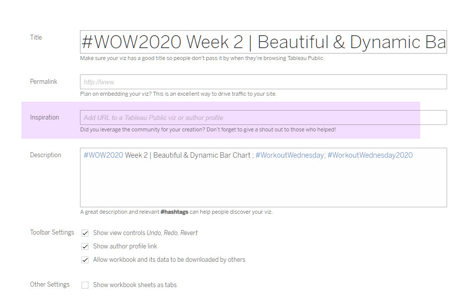
When you publish your solution on Tableau Public make sure to take the time and include a link to the original inspiration. Also include the hashtag #WOW2020 in your description to make it searchable!

Share
After you finish your workout, share on Twitter using the hashtag #WOW2020 and tag @AnnUJackson, @LukeStanke, @_Lorna_Brown and @HipsterVizNinja
