Introduction
Week 20 already! Crazy how fast the year is going by…and how fast you’re skilling up in Sigma!
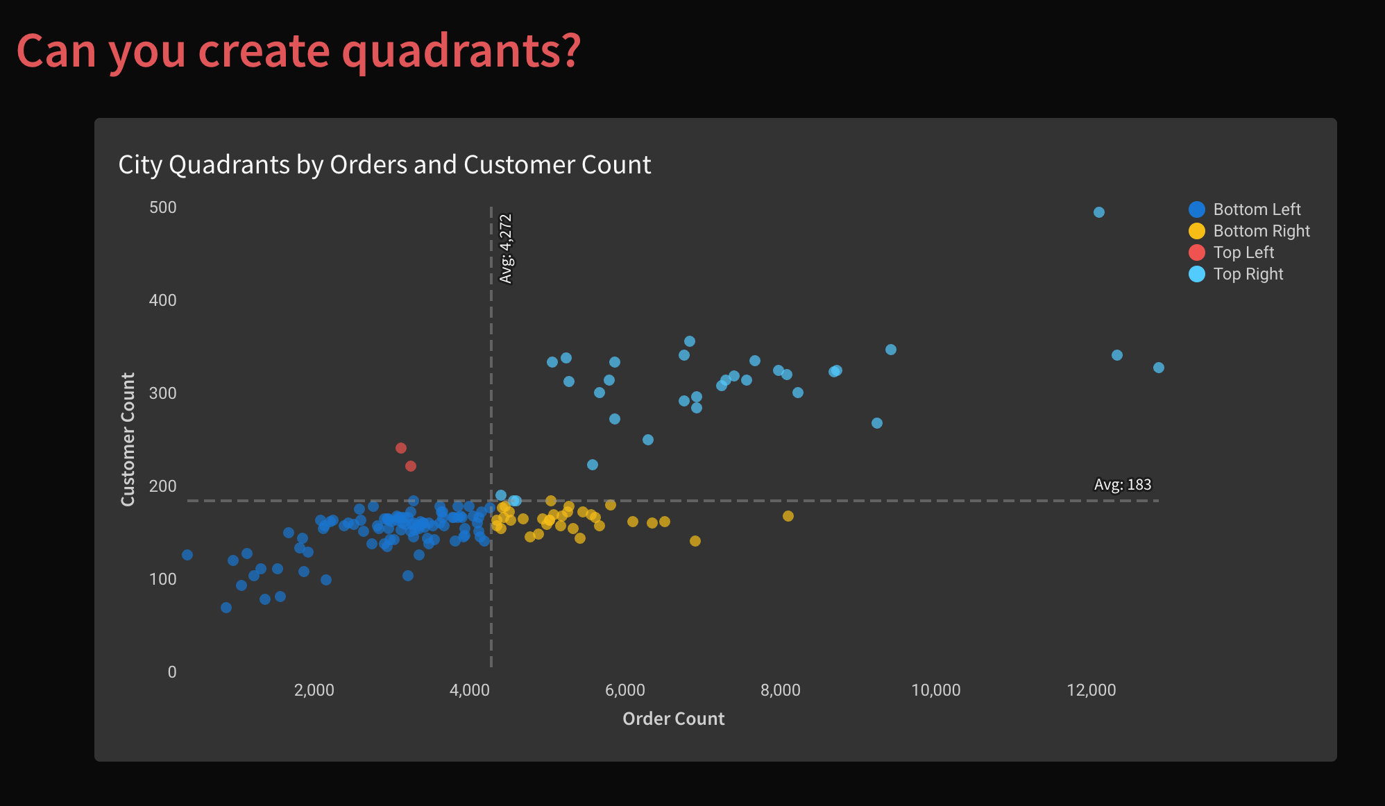
I love scatter plots. They’re a great way to display a lot of information in an easily consumable package. Layering quadrant colors on top, make it even easier to visually group dots and find outliers.
-Katrina
Need access to Sigma?
Note: You will only have view access to WOW Workbooks, Folders, and Workspaces, not edit access. Please create your WOW Workbooks under “My Documents.” We suggest creating a folder to organize all your workbooks.
Requirements
- Add a data table element from the Plugs Electronic
- Sigma Sample Database > Retail > Plugs Electronic > PLUGS_ELECTRONICS_HANDS_ON_LAB_DATA
- Create a scatter plot showing each Story City’s Distinct Count of Customers and Distinct Order Count
- Show a dashed line for the overall Customer Count and Order Count Averages
- Color the four quadrants
- The four quadrants are defined as above or below the overall average customer count and order count
- You can use any colors you’d like
- Optional: Name the quadrants to describe the city better
- Formatting:
- Match the Title
- Use a dark background
- Remove tick marks and grid lines
- Label Axes
- Label the dashed Avg Lines
- Hide the Data Tab
- Match the visible tab with elements and title
Dataset
Sigma Sample Database > Retail > Plugs Electronic > PLUGS_ELECTRONICS_HANDS_ON_LAB_DATA
Share
After you finish your workout, share on LinkedIn, Sigma’s Community page, (or Twitter) using the hashtags #WOW2024 and #SigmaComputing, and tag Ashley Bennett, Eric Heidbreder, Katrina Menne, and Michal Shaffer!
Create an interactive, sharable version of your solution here.
Also, make sure to fill out the Submission Tracker so that we can count you as a participant this week to track our participation throughout the year.
Solution