Introduction
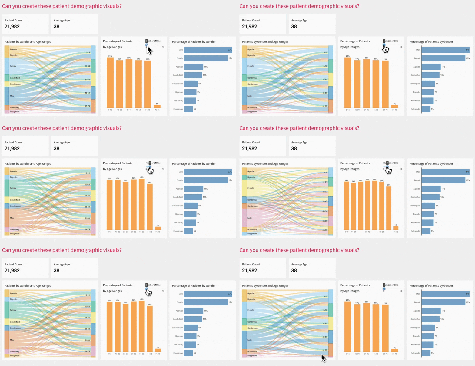
Hey everyone! This week’s Workout Wednesday focuses on creating clear, actionable patient demographic visuals using a Sankey, a KPI, and two bar charts—binned and unbinned.
Here’s the setup: the Sankey chart helps us map distribution, while the KPI delivers an at-a-glance view of a key metric to ground the analysis. With the bar charts, we’ll explore both binned and unbinned versions. The binned chart groups data into ranges, making it easier to see overall trends, while the unbinned chart keeps the fine details intact.
Have fun!
-Katrina
Need access to Sigma?
Note: You will only have view access to WOW Workbooks, Folders, and Workspaces, not edit access. Please create your WOW Workbooks under “My Documents.” We suggest creating a folder to organize all your workbooks.

Requirements
- KPI for the patient count
- KPI for the Average Patient Age
- Sankey showing the patient count for the gender and dynamic age ranges
- Note this is reusing the dynamic age ranges from the binned bar chart
- A horizontal bar chart showing the percentage of patients in the dynamically created bins
- The end user should be able to control how many bins are used
- A dynamic label for the min and max ages in each bin
- Be sure this sorts correctly when the bin sizes change 😉
- A vertical bar chart showing the percentage of patients by gender
Dataset
SIGMA SAMPLE DATABASE > HEALTHCARE_LIFESCIENCES > PHARMA_COHORTS > PATIENTS
Share
After you finish your workout, share on LinkedIn, Sigma’s Community page, (or Twitter) using the hashtags #WOW2024 and #SigmaComputing, and tag Ashley Bennett, Eric Heidbreder, Katrina Menne, and Michal Shaffer!
Create an interactive, sharable version of your solution here.
Also, make sure to fill out the Submission Tracker so that we can count you as a participant this week to track our participation throughout the year.