Can you re-imagine this influential map?
Introduction
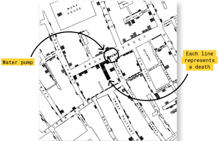
In 1854, Dr. John Snow mapped cholera deaths in London to investigate how the disease was spreading. At the time, most believed cholera came from “bad air.” Snow used mapping to reveal a strong cluster of deaths around a single water pump on Broad Street, proving that contaminated water—not air—was the true cause. His work fundamentally changed public health and introduced a new way to use data visualization to uncover hidden patterns.
In this exercise, you’ll recreate part of Snow’s original analysis using Sigma’s Mapbox integration. While the basemap won’t match 1854 London exactly, it allows us to approximate Snow’s breakthrough by layering deaths, sewer grates, and pumps onto a real-world street grid. You’ll learn how to:
- Plot different types of points (deaths, sewer grates, and pumps) on a real-world map
- Customize colors, sizes, and formatting based on attributes
- Identify patterns by layering data visually
- Utilize legend controls
Best of British!
Carter
Need Access to Sigma?
Note: You will only have view access to WOW Workbooks, Folders, and Workspaces, not edit access. Please create your WOW Workbooks under “My Documents.” We suggest creating a folder to organize all your workbooks.
Original 1854 Map

Requirements
Upload your dataset (.csv) to Sigma
Download the .csv files from below and create one .csv with all the fields
[HINT: duplicate some of the columns in order to use them in multiple Properties when building the map]
Convert XY (Easting/Northing) to Latitude and Longitude
The dataset uses British National Grid (e.g., COORD_X and COORD_Y in meters), so you’ll need to convert them to Latitude and Longitude first.
Use this prompt in your tool of choice:
🧠 Prompt:
“Convert these coordinates from British National Grid (EPSG:27700) to WGS84 latitude and longitude. Output as a table with added Latitude and Longitude columns.”
(Paste your dataset sample with COORD_X and COORD_Y columns.)
Create a Map element & assign the location fields from the .csv
[HINT: Use Map – Point]
Use the “Type” field to set color and adjust point sizes using Sigma’s formatting options
Create a Mapbox base map in your own style (you can create a free account)
Choose custom Mapbox style
Add your Mapbox style URL and Access Token
Add filters for interactivity
Use the Tooltip property to show any fields when a user hovers over a point.
Publish your workbook or dashboard!
Dataset
John Snow & the 19th Century Cholera Epidemic
Share
After you finish your workout, share on LinkedIn, Sigma’s Community page, (or Twitter) using the hashtags #WOW2024 and #SigmaComputing, and tag Ashley Bennett, Eric Heidbreder, Katrina Menne, Carter Voekel, and Michal Shaffer!
Create an interactive, sharable version of your solution here.
Also, make sure to fill out the Submission Tracker so that we can count you as a participant this week to track our participation throughout the year.
Solution
Coming soon…