Introduction
For this week’s challenge, I’m showcasing a variety of features using data based on the English Premier League once again.
Measure switching is the primary focus for this challenge, which is something many #WOW challenges have used in the past. But you may be new to the #WOW project this year, so it’s always good to make sure we’re covering all the useful fundamental techniques. Of course, the challenge is sprinkled with lots of other little requirements, and for those want to push themselves a little further, I’ve provided a bonus challenge which focuses on how the rows of data are being presented.
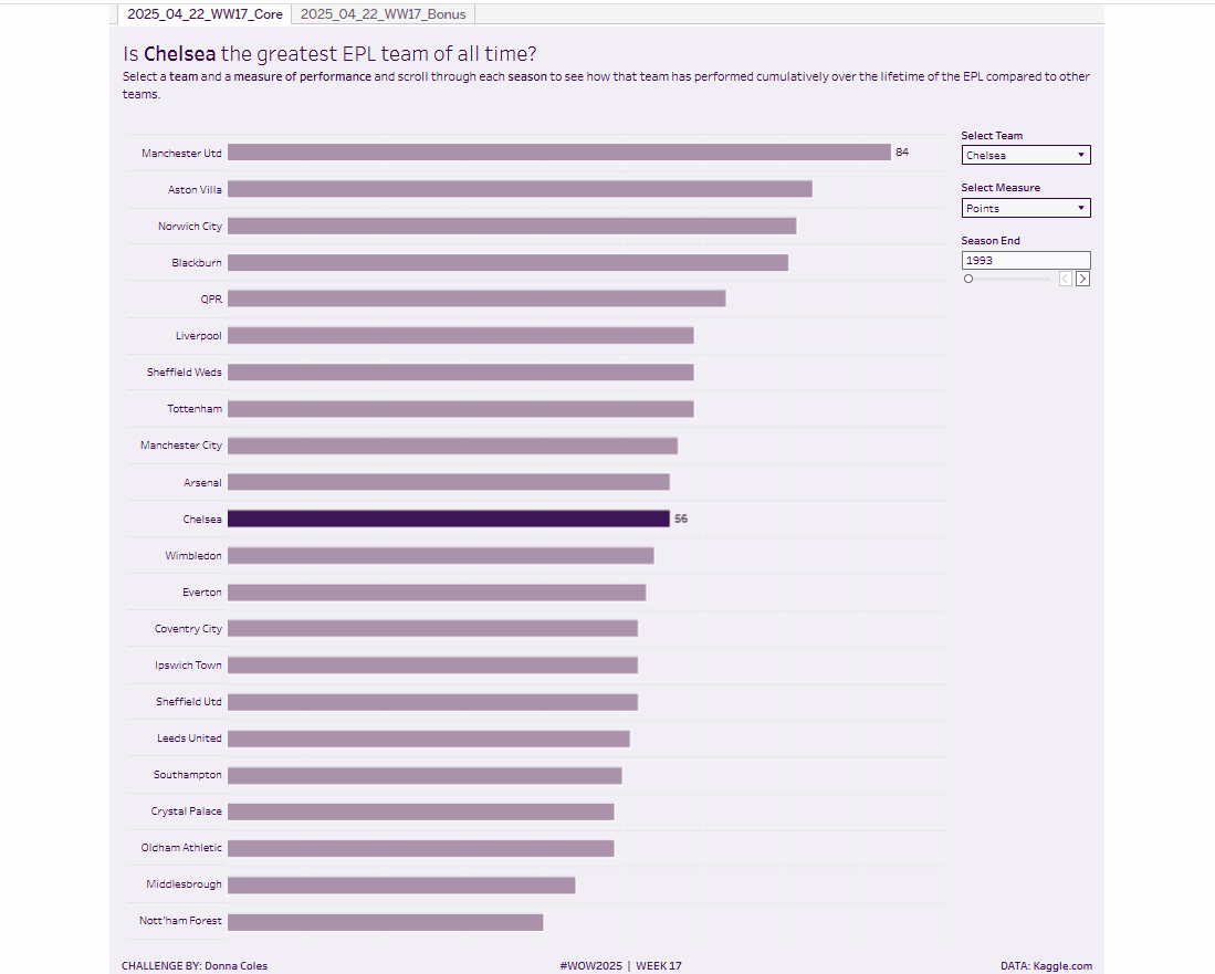
For this challenge, the premise is to try to understand which team may be considered the greatest EPL team of all time, by following how a selected team and measure cumulates over the seasons. The data provided includes both the measure values per season, along with the equivalent cumulated values, so you don’t need to calculate those 🙂
Note – this is a very ‘rough’ analysis as it’s not really giving any consideration to how many seasons each team has played in the EPL.
Requirements
Core Challenge
- Size 1000 x 1000
- 1 sheet
- Create a bar chart that displays the selected cumulative measure for each team for each season.
- The user can select one of the 4 measures : Points, Goal Difference, Goals For or Goals Against
- Sort the data from best to worse – in the case of Goals Conceded, the lower the number the better
- Allow the user to select a single team and highlight them in a different colour on the chart
- Allow the user to manually scroll through each season to see how the team’s position changes throughout the seasons – note how the bars transition as you click through each season.
- Teams should only be displayed in the bar chart once they earn some points in a season (that is in 1993 only 22 teams should be listed, but by 2024, all 51 teams should be displayed.
- Label the bar for the team selected as well as the team in 1st place.
- Display on the tooltip both the current season’s selected measure along with the cumulated value.
- Include the selected team in the title
- Match formatting. Use the same colour scheme, or choose your own. Colours used
- background – pale purple #f1eff6
- bars- mid purple #ac92aa
- selected bar and font dark purple #3e1756
Bonus Challenge
As above, but display the bars centrally on a horizontal line, with the team names aligned centrally to the left hand side. Pay attention to how the display looks for the lower teams when Goal Difference is selected. There should be minimal spacing between the team name and the start of the line.
Dataset
Data has been curated but was originally sourced from Kaggle.com. It is available here.
Attribute
When you publish your solution on Tableau Public make sure to take the time and include a link to the original inspiration. Also include the hashtag #WOW2025 in your description to make it searchable!

Share
After you finish your workout, share on Twitter and/or LinkedIn using the hashtag #WOW2025 #Tableau and tag @WorkoutWednsday
Solution
Interactive
