I often use the #datafam community as inspiration for my #WOW challenges, as it gives me the perfect opportunity to try out a particular technique or visualisation style, which I hope you all then benefit from too 🙂
This week’s challenge was inspired by this blog post by the Flerlage Twins, which in turn was inspired by other members of the #datafam.
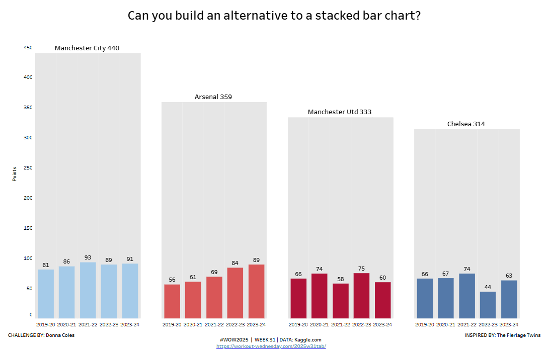
So for this week, we’re going to build an alternative to a stacked bar chart, but make use of some English Premier League data instead (a recurring theme for me this year 🙂 ).
Only show data for the last 5 seasons in the dataset and for the following teams : Manchester City, Manchester Utd, Arsenal & Chelsea
Display bars of the total points cumulated by each of the 4 teams across the last 5 seasons.
Label the bar with the team and the total points
Sort the bars so the team with the highest cumulated points is listed first
Ensure there is noticeable spacing between the bars
Within each bar, display bars representing the actual points the team accumulated per season.
Label the bars with the points
Colour based on the team’s home colour – I used:
Manchester City #a0cbe8
Manchester Utd #b8163a
Arsenal #e15759
Chelsea #4e79a7
Match tooltips and formatting
Dataset
The data was originally sourced from Kaggle.com but is available from here.
Attribute
When you publish your solution on Tableau Public make sure to take the time and include a link to the original inspiration. Also include the hashtag #WOW2025 in your description to make it searchable!