Introduction
I created this viz to show off some crazy golf scores from my latest cohort at The Data School, especially to show off the fact I won.
But I added in some Table Calculations and other bits to add some context, I thought it would make a good challenge.
Requirements
- Dashboard Size 1300×800
- 3 worksheets
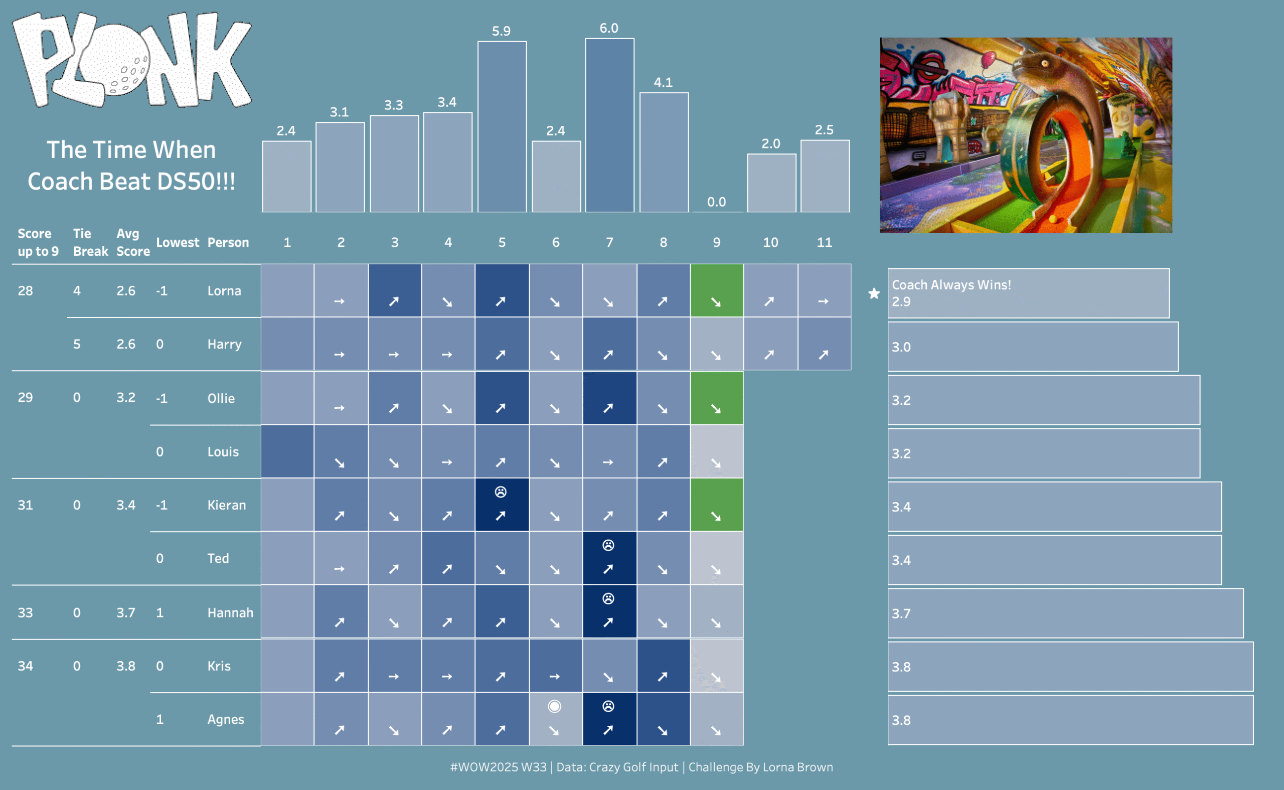
- Create a heat map showing the scores for each hole
- Create an Average for each hole and the average for each person (including the tie break holes which were 10 & 11)
- To create the sorting you will need to calculate:
- the score up until the 9th hole
- the tie break scores (hole 10 & 11)
- the Average score (not including the tie break holes)
- The lowest that person scored)
- The arrows represent consistency compared to the prior hole.
- Straight arrow means same number of shots
- diagonally up means more shots than previous
- diagonally down means less shots than previous
- Another icon is for when Agnes got a hole in 1 (not including the 9th hole as that had minus figures available)
- And finally the last icon is when someone had the max number of shots (10) on any one hole.
- Format how you like
Dataset
Manually inputted golf score. Available from here.
Attribute
When you publish your solution on Tableau Public make sure to take the time and include a link to the original inspiration. Also include the hashtag #WOW2025 in your description to make it searchable!

Share
After you finish your workout, share on Twitter and/or LinkedIn using the hashtag #WOW2025 #Tableau and tag @WorkoutWednsday
Solution
Interactive
Not including the interactive viz as it is broke on Tableau Public. Use the Image as guidance.
