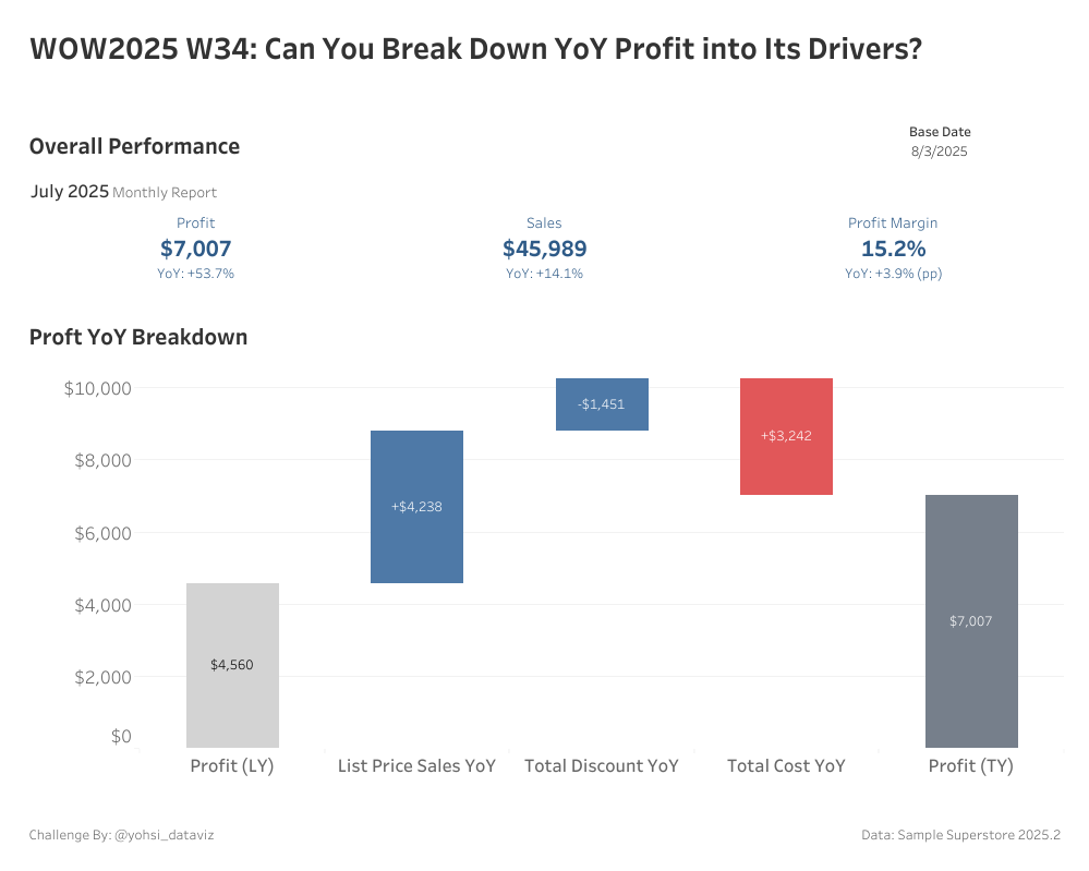
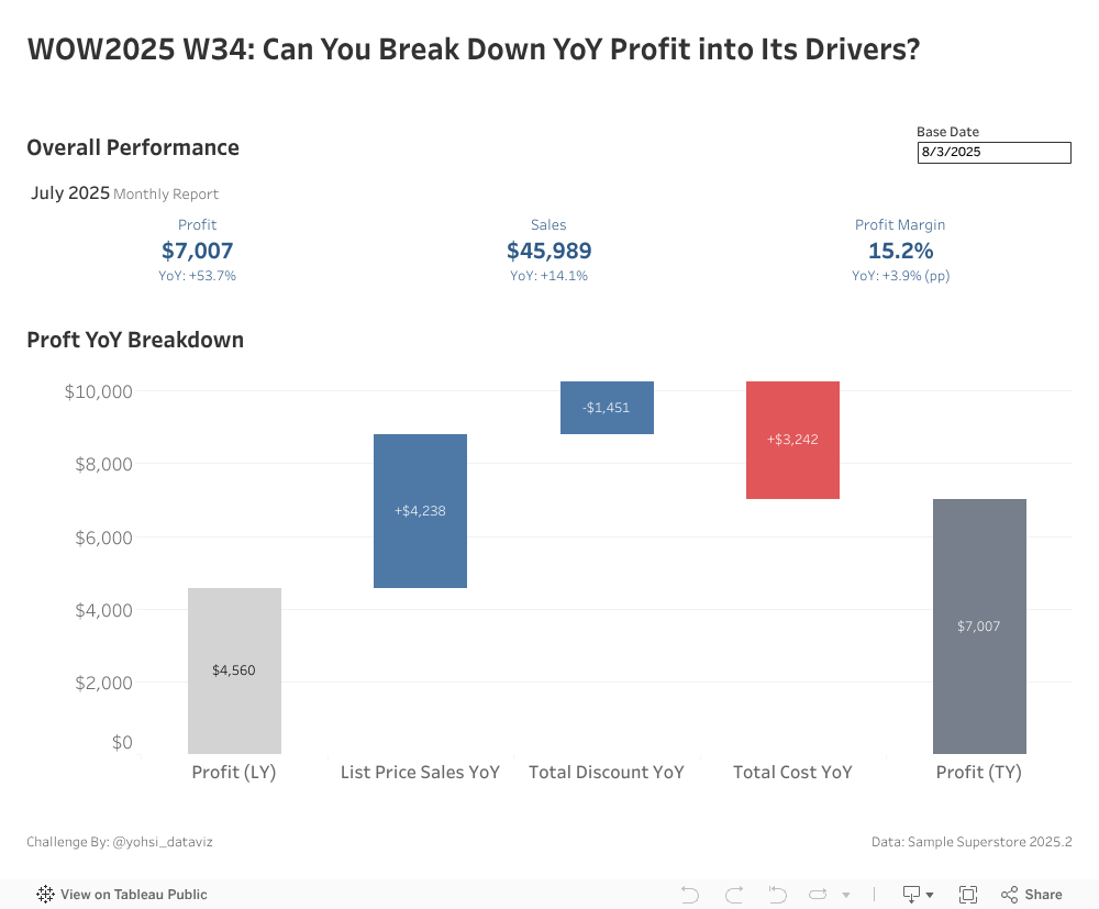
I’ve been playing around with Tableau MCP and something called “Vibe Analytics” lately (look them up if you’re curious!). This week’s challenge was inspired by working with a generative AI to analyze the Sample Superstore dataset, exploring ways to break down profit into its key drivers and compare year-over-year performance. Have fun building this waterfall chart!
List Price, Discount Amount, and Cost are calculated as follows:
List Price = Sales ÷ (1 – Discount)
Discount Amount = List Price × Discount
Cost = Sales – Profit
Use blue for changes that increase profit, red for changes that decrease profit
Display TY Profit and LY Profit in gray
Show labels
Match tooltips as match as possible
Dataset
This challenge users Sample Superstore 2025.2 data. You can download the data here (Google Drive).
Attribute
When you publish your solution on Tableau Public make sure to take the time and include a link to the original inspiration. Also include the hashtag #WOW2025 in your description to make it searchable!