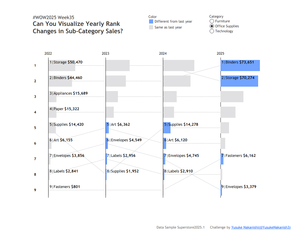
I’ve recently been running several hands-on Tableau workshops for beginner- to intermediate-level users across different prefectures. In one of those sessions, a participant asked how to visualize both ranking changes and differences in sales at the same time. This week’s challenge was inspired by that question. It might be a bit tricky, but I encourage you to give it a try!
If you want your bars to stretch nicely across a continuous date axis, you might need to normalize your values to fit within a one-year scale. One way to do this is min-max normalization.
This challenge users Sample Superstore 2025.2 data. You can download the data here.
Attribute
When you publish your solution on Tableau Public make sure to take the time and include a link to the original inspiration. Also include the hashtag #WOW2025 in your description to make it searchable!