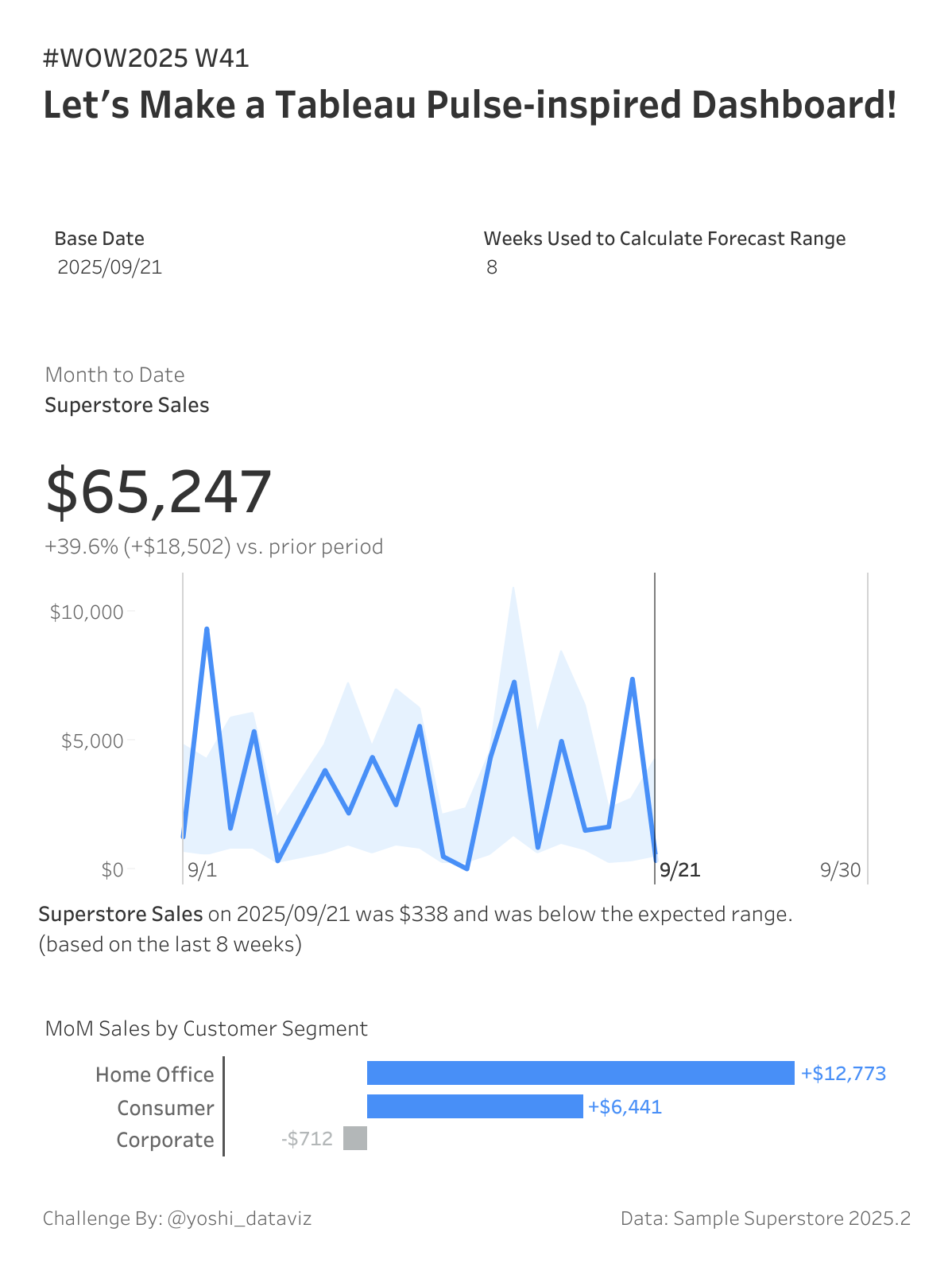
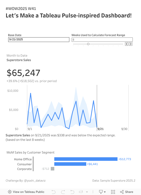
In this challenge, you’ll recreate a Tableau Pulse–inspired dashboard from scratch. One of the key features of Tableau Pulse is to automatically detect trends and changes in your data, displaying an “Expected Range” for each metric to help users instantly grasp performance at a glance.
Your task is to reproduce this concept using Tableau’s predictive modeling functions. Using past data, you’ll calculate an expected range and indicate if a target metric falls within it. Enjoy!
You will need to convert the weekday to a string to ensure it is recognized as a dimension.
Display the range as the area between the 25th and 75th percentile values.
Add reference lines for the base date and the first/last day of the month.
Indicate whether the base date’s sales are above, within, or below the expected range as text.
Build a bar chart showing MoM sales by segment, coloring bars based on positive or negative change.
Match tooltips.
Dataset
This challenge users Sample Superstore 2025.2 data. You can download the data here (Google Drive).
Attribute
When you publish your solution on Tableau Public make sure to take the time and include a link to the original inspiration. Also include the hashtag #WOW2025 in your description to make it searchable!