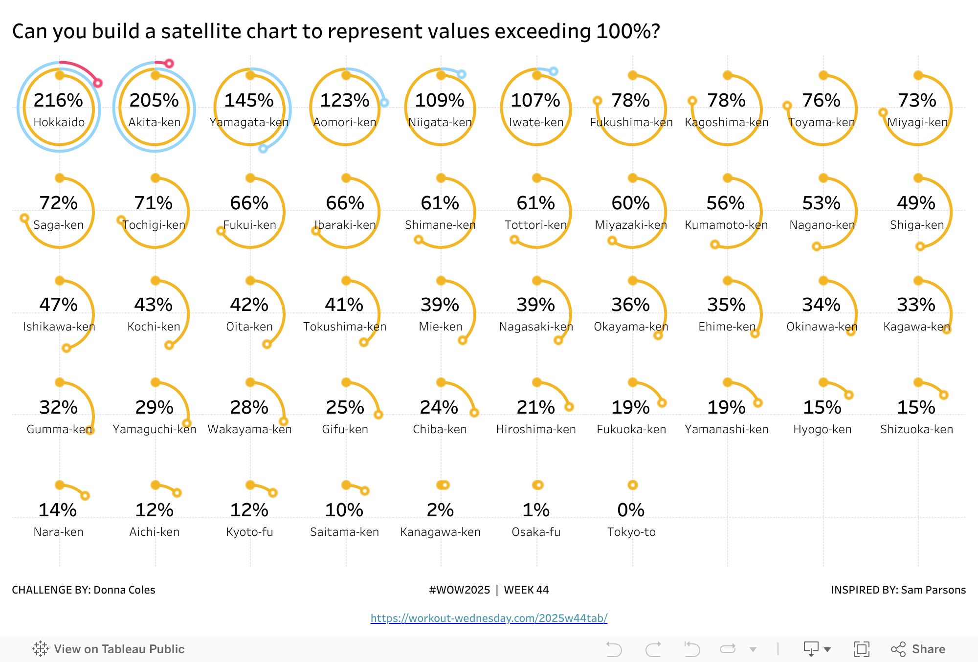
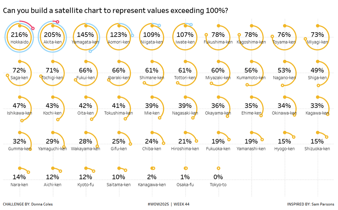
Introduction
Some time ago the brilliant Sam Parsons, developed a “Satellite” or “Spiral” Chart as an alternative way to visualise a donut that exceeded 100%.
https://public.tableau.com/app/profile/sparsonsdataviz/viz/SpiralingSatelliteCharts/SpiralingSatelliteCharts.
As with many things Sam comes up with, I always want to see if I can build it, and once again it’s a great excuse for a #WOW challenge.
Back in Week4 of 2024, Yusuke set a similar challenge to visualise donuts exceeding 100% through use of colour (https://doncol80.dreamhosters.com/2024w04tab). I figured I’d use the same data to produce the satellite chart instead.
I appreciate this isn’t going to be the easiest of challenges, so I will try to provide as much help as possible, without providing the full solution of course (I’ll blog that later).
Along with the data, a scaffold dataset is required to build the spiral, as a mark will need to be plotted for every 1% from 0 up to the food self-sufficiency ratio for each prefecture (aka district), so the data needs to be densified
Requirements
- Dashboard 1000 x 650
- Densify the data by relating the Self-sufficiency data set with the Circle Scaffold data set using a 1=1 relationship.
- Build a trellis chart of satellite charts displaying the Food Self-Sufficiency Ratio in Japan for FY2019 for all Prefectures.
- Display in a trellis of 10 columns and 5 rows with the charts ordered from highest (top left) to lowest (bottom right)
- Each satellite chart should colour code the spiral to differentiate the ranges – you can use any colour palette you wish – colours I’ve used below
- < 100% (yellow #f1b626)
- >= 100% and < 200% (blue #96d4f8)
- >=200% (red #ec4770)
- Multiple map layers will be required
- 1 to display the % rate and Prefecture
- 1 to display the spiral
- 1 to display the closed circle at the % starting point
- 2 to display the open circle at the % ending point
- Clicking anywhere on the chart shouldn’t highlight/select anything
- Match formatting and tooltips
- Start by building a satellite chart for a single prefecture first, specially one with a value > 200%
- Create calculations for
- Radius : The spiral shape is achieved by plotting points on a circle where the radius of the circle is increasing every 1%. Use a parameter to define the minimum /starting radius (ie the radius of the circle at 0%), as you may need to adjust to make your spirals fit. I set my parameter to 500.
- Angle : Determine the angle (in radians) for every 1% point, given that a circle of 360° represents 100%.
- X : Baaed on trigonometry, the X coordinate of the point is determined by the (Sine of the angle * radius) / 360
- Y: Based on trigonometry, the Y coordinate of the point is determined by the (Cosine of the angle * radius) / 360
- Note division by 360 for these last 2 fields is required due to the spiral shape being built and because we’re using map layers – if we were simply plotting X against Y without using map layers, this division wouldn’t be necessary.
- This blog by Ken Flerlage will be useful to understand the maths:
Dataset
The challenge uses the data set used in #WOW2025 Week 4 which I’ve created in a CSV format and a scaffold dataset, both available from here.
Attribute
When you publish your solution on Tableau Public make sure to take the time and include a link to the original inspiration. Also include the hashtag #WOW2025 in your description to make it searchable!

Share
After you finish your workout, share on Twitter and/or LinkedIn using the hashtag #WOW2025 #Tableau and tag @WorkoutWednsday
Solution
Interactive