Introduction
Brad Werner is responsible for this week’s Workout Wednesday Challenge. Here are all the details in Brad’s own words:
I have a confession. When I first started using Tableau, I was a strict advocate for #TeamFloating. Yes, I used to float ALL objects on my Tableau dashboards. I would decide on a dashboard layout and then calculate the pixel height and widths needed in order to make everything look just right. Not fast or scalable.
Then came along a Workout Wednesday challenge that changed my approach to dashboard design and converted me to #TeamTiled.
Rody Zakovich’s 2018 Week 51 challenge titled Container Fun.
This challenge helped me to see that any layout I wanted to use was just a combination of vertical/horizontal containers and inner/outer padding. I can now look at any design inspiration, deconstruct it into containers/padding, and recreate it in Tableau.
If you struggle with containers, please know that it is not just you. Containers continue to be a popular topic in the Tableau community. Tableau Zen Master Hall of Famer Andy Kriebel recently put out a simple question asking if people would be interested in seeing his process. Look at the response it got! 🤯
I'm working on a simple social media KPI dashboard. I have all of the charts built. Would it be useful/helpful if I recorded how I create the dashboard? Like how I use containers, padding, shading, etc.
— Andy Kriebel (@VizWizBI) November 10, 2020
I am excited to bring back a container challenge to Workout Wednesday in the hopes that it can help others learn about all the awesome ways that containers can improve the look of their dashboards. This technique, combined with using Tableau’s format tools to maximize the data to ink ratio, is a sure way to improve the look of your dashboards.
If you want to learn more about how to use containers in Tableau, check out a few of my favorite resources below.
- Things I Know About Tableau Layout Containers by Curtis Harris
- How I Use Layout Containers Part 1 and Part 2 by Andy Kriebel
- These were the videos that resulted from Andy’s tweet above.
- How to Make Working With Dashboard Containers EASY by Trent Haun
- This includes the trick I use to help me make sense of the containers I have added to a dashboard; Every time you pull a container out onto your canvas, fill it in with placeholder text.
Requirements
- Dashboard Size: 1200px x 800px
- ONLY USE CONTAINERS, NO FLOATING OBJECTS!
- Feel free to use as many containers as you would like. My version uses 6 and I believe this is an optimal number for this challenge.
- The background of the dashboard is light gray (#f5f5f5 – “The top gray”)
- But notice the title bar is white all the way across.
- You can grab the logo from the top of the WorkoutWednesday website in the navigation bar. Add 5px of outer padding for a nice look.
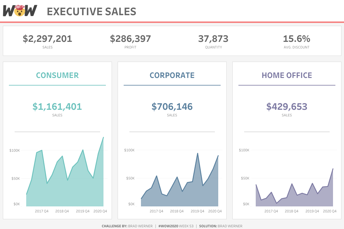
- This layout utilizes a card-style design. There are 4 cards (1 KPI card and 3 segment cards). Each card has 10px of padding around them and 10px of padding within them.
- Each card also has a solid, thin, and slightly darker gray border (#d4d4d4 – “The third from the top gray”)
- The three Segment cards each contain the following items:
(anything that does not have padding specified is set to the default outer padding of 4px)- A text header
- A colored divider 3px tall with 10px of padding on both ends
- A BAN showing total sales for the column’s segment
- A gray (#d4d4d4) divider 2px tall with 30px of padding on both ends
- An area chart showing quarterly sales for the column’s segment
- Here are the colors that I used (but feel free to give it your own spin!)
- Red: #F57D7C
- Teal: #6CC2BD
- Blue: #5A809E
- Purple: #7C79A2
Dataset
This week uses the superstore dataset for Tableau 2020.3. You can get it here at data.world. Since this challenge focuses on containers and structure, data accuracy matters less so feel free to use whatever version of superstore you have on hand.
Attribute
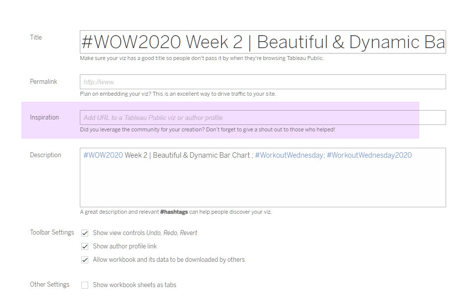
When you publish your solution on Tableau Public make sure to take the time and include a link to the original inspiration. Also include the hashtag #WOW2020 in your description to make it searchable!

Share
After you finish your workout, share on Twitter using the hashtag #WOW2020 and tag @Brad_Werner, @AnnUJackson, @LukeStanke, @_Lorna_Brown and @HipsterVizNinja
