James Stratton

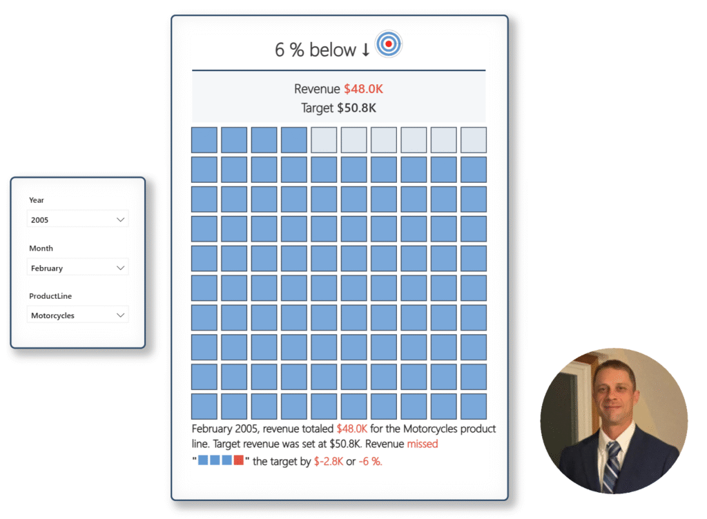
2025 Week 32 | Build a Waffle Chart using Core Visuals

Introduction This week, we’re cooking up something a little different – waffle charts! Your challenge is to build a report that compares actual sales to a dynamic monthly target and visualizes progress in a clean, impactful way. Requirements Get and Prepare Data Start by downloading the CSV file provided. It contains 8 columns: ORDERNUMBER QUANTITYORDERED …

2025 Week 32 | Build a Waffle Chart using Core Visuals Read More

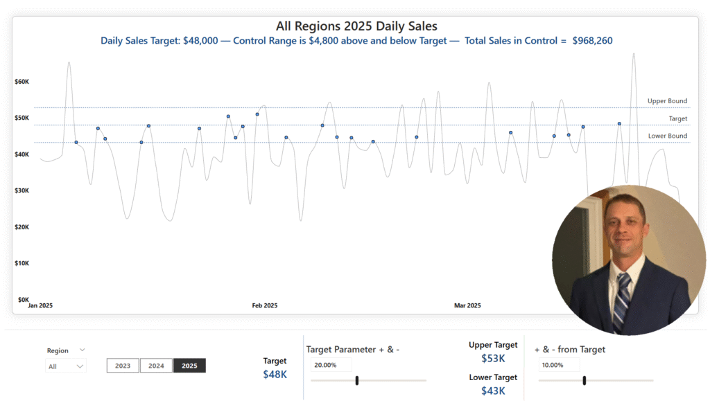
Screenshot of a Power BI report that looks like a line chart with a picture of James in the lower right corner.

2025 Week 17 | Power BI: Create a control chart

Introduction Welcome back to Workout Wednesday!  This week we’re building a Control Chart. Control charts can be used to track a specific process measure – such as sales, defects, or processing time – over a period of time. A few common uses are: Manufacturing: Monitoring defect rates and equipment performance  Healthcare: Tracking infection rates, patient …

2025 Week 17 | Power BI: Create a control chart Read More

Scroll to Top