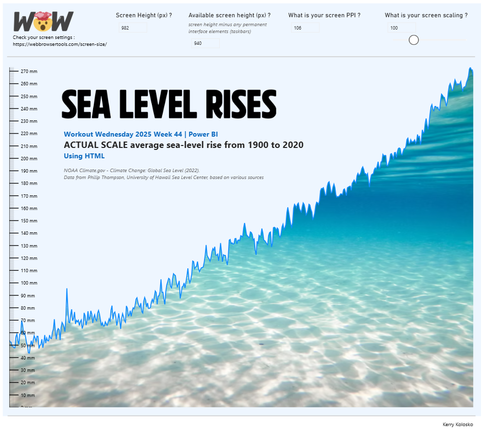
2025 Week 44 | Power BI: Utilising HTML to create actual scale charts
Introduction In this week’s challenge we are going to try to create a chart on rising sea levels where the y-scale of mm will display on screen in physical mm. You can try this with whichever custom visual you like, but the example laid out below will be for the utilisation of the HTML Content […]
2025 Week 44 | Power BI: Utilising HTML to create actual scale charts Read More »