2023 Week 14 | Power BI: Word Cloud and Modulo
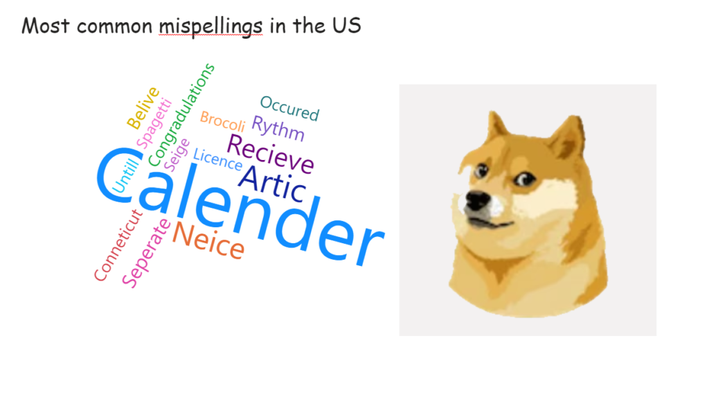
Introduction This week’s challenge is inspired by recent Twitter activities. We are creating a word cloud containing common misspellings in the US. Requirements Power Query Obtain the dataset from https://www.dailymail.co.uk/femail/article-11357183/Google-search-data-reveals-commonly-misspelled-words-spell-correctly.html OR https://github.com/kolky001/Workout-Wednesday-2023/blob/main/Misspellings Transform and load data HINT : Add Index column, create modulo column, unpivot data Power BI Desktop Obtain Word Cloud custom visual from […]
2023 Week 14 | Power BI: Word Cloud and Modulo Read More »
Power BI, Workout Wednesday