2026 Week 18 | Sigma: AI Sentiment Analysis with Snowflake Cortex
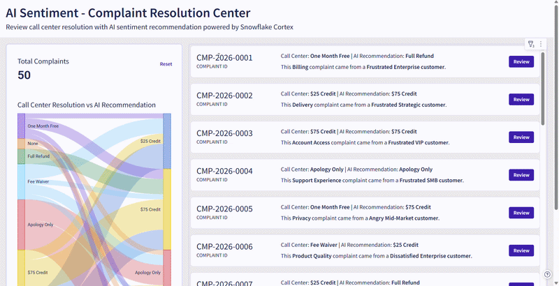
Introduction Imagine you are the Senior Customer Success Manager at a SaaS company that runs on a subscription model, and you are responsible for reviewing complaint resolutions proposed by junior-level agents. This week, we are bringing Snowflake AI_Sentiment(), AI_Classify(), and AI_Complete() functions into Sigma AI App. Snowflake Cortex AI will help you identify the customer’s […]
2026 Week 18 | Sigma: AI Sentiment Analysis with Snowflake Cortex Read More »
Sigma, Workout Wednesday