2021 Week 47 | Power BI: Custom Line Chart Formatting
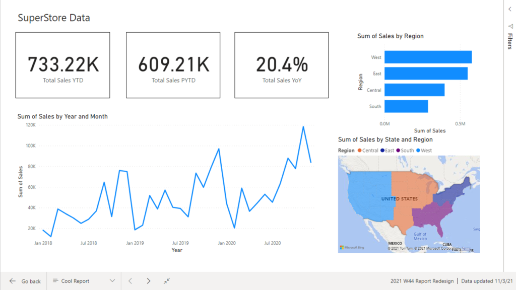
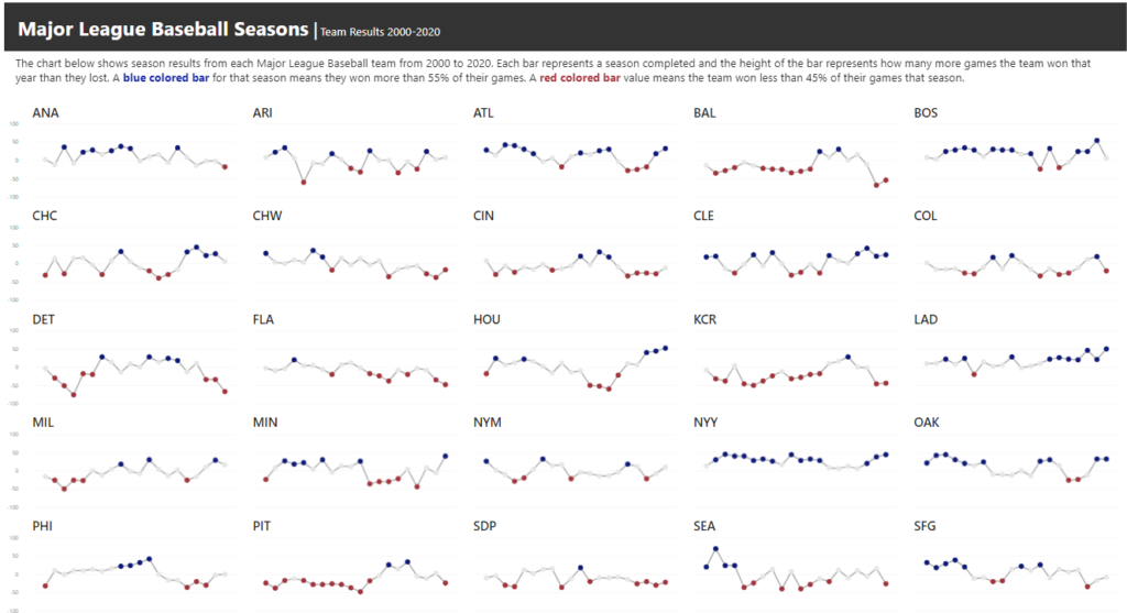
Introduction This week we are continuing our design theme by working through a custom formatting hack for line charts. Conditional formatting in Power BI can be tricky at times, especially when trying to format different chart types. If you are familiar with conditionally formatting a line chart, you’ll know that in the Data Colors section […]
2021 Week 47 | Power BI: Custom Line Chart Formatting Read More »
Power BI, Workout Wednesday