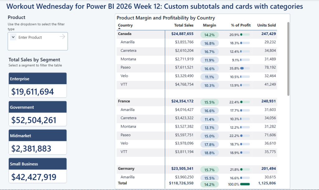
Power BI

2025 Week 21 | Power BI: Scatterplot / Timeseries Smoothing

Introduction When looking at timeseries data, we may encounter high variability from one week to the next, creating highly jagged and difficult to read charts. There are a number of techniques to smooth the lines to better depict trend. Some may use rolling averages, others, like YouGov, use LOESS regression. https://yougov.co.uk/topics/society/trackers/how-often-brits-exercise In this weeks challenge …

2025 Week 21 | Power BI: Scatterplot / Timeseries Smoothing Read More

2025 Week 20 | Year-over-Year Selected Metric Trends

Introduction Welcome to Week 21 of 2025! This report allows users to select a performance metric (e.g., Revenue) and compare its values across 2024 and 2023. It provides a flexible way to explore year-over-year changes and spot trends or anomalies through interactive visuals. Good luck! -Andrei Requirements Main Visual: Area Chart with Year-on-Year Comparison Green …

2025 Week 20 | Year-over-Year Selected Metric Trends Read More

Screenshot of a skyline chart created using Deneb in Power BI

2025 Week 18 | Power BI: Create a skyline chart

Introduction Hello everyone! This week we are looking at developing a ‘Skyline’ visual.   Anyone outside of the construction industry may not have heard this term before, but it is kind of a combination of a stacked column visual and a kanban board.   It is used in construction to show construction activities (workpacks) that …

2025 Week 18 | Power BI: Create a skyline chart Read More

Screenshot of a Power BI report that looks like a line chart with a picture of James in the lower right corner.

2025 Week 17 | Power BI: Create a control chart

Introduction Welcome back to Workout Wednesday!  This week we’re building a Control Chart. Control charts can be used to track a specific process measure – such as sales, defects, or processing time – over a period of time. A few common uses are: Manufacturing: Monitoring defect rates and equipment performance  Healthcare: Tracking infection rates, patient …

2025 Week 17 | Power BI: Create a control chart Read More

2025 Week 16 | Power BI: Cards – NEXT Level | with emojis and variances label

Introduction 🎉 Happy Workout Wednesday, data fam! 🎉 I’m thrilled to be back with another Power BI challenge—and this one is all about taking something simple and pushing it to the NEXT level! 💪 Cards are often the go-to for showing big, bold numbers. But what if we could make them smarter? More informative, expressive, …

2025 Week 16 | Power BI: Cards – NEXT Level | with emojis and variances label Read More

Screenshot of a Power BI report with the title Global Health & Safety Monitor

2025 Week 15 | Power BI: The 2025 DataViz World Champion has been crowned!

Introduction Welcome back to Workout Wednesday!  Last week, 6,000 of our closest friends met up in Las Vegas for the 2nd annual Fabric Community Conference. The Workout Wednesday team had a strong showing!   We hosted a pre-conference meetup with a hundred of our friends, where we completed a Workout Wednesday exercise live! Thanks to everyone who …

2025 Week 15 | Power BI: The 2025 DataViz World Champion has been crowned! Read More

2025 Week 12 | Power BI: Animated Progress Bar with Edward Charles

Introduction Welcome back to Workout Wednesday! This week’s challenge is all about bringing your data to life with animation! It was inspired by a LinkedIn post from Edward Charles, where he used an SVG measure and the new card visual to create an animated progress bar.   Progress bars can be a great way to visually track goals, completion …

2025 Week 12 | Power BI: Animated Progress Bar with Edward Charles Read More

Scroll to Top