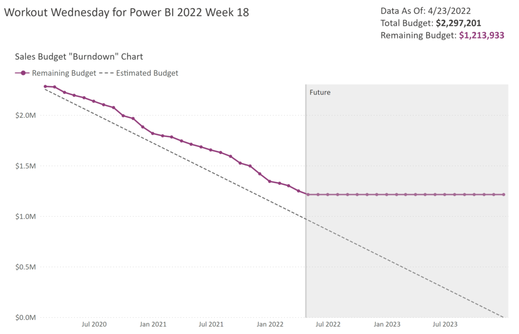
2022 Week 18 | Power BI: Remake this Tableau budget burndown chart
Introduction For the month of May, we are remaking Tableau visualizations with Power BI. Although the visuals made by the two tools may be similar, the calculations and formatting options are a bit different. This makes some things easier in one tool compared to the other. If you use both Power BI and Tableau, feel …
2022 Week 18 | Power BI: Remake this Tableau budget burndown chart Read More