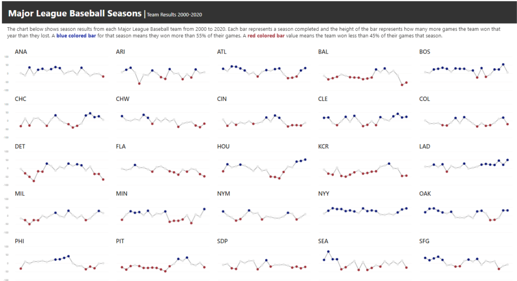
2021 Week 48 | Power BI: Create a Waffle Chart
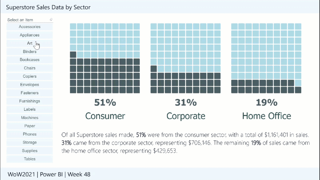
Introduction This week we are continuing our design theme and using the waffle chart custom visual. Waffle charts show progress toward a whole or a target percentage, and can be used as an alternative to bar and/or pie charts. The Waffle Chart custom visual in Power BI allows us to customize the icon (here we …