Power BI

2022 Week 38 | Power BI: Create a Waterfall Pipeline

Introduction Welcome back to Workout Wednesday! This week we’re collaborating with the Tableau team to create a waterfall pipeline using Salesforce data. Lorna Brown, the creator of the challenge is attending Saleforce’s Dreamforce conference, hence the nature of the challenge. We’re building a waterfall chart using the Simple Waterfall custom visual by Datanomy Limited. This week’s workout can be done in …

2022 Week 38 | Power BI: Create a Waterfall Pipeline Read More »

2022 Week 36 | Power BI: Split Violin Plot and HTML

Introduction Another PlotlyJS visual this week – creating a split violin plot. We’ll be comparing male and female dating preferences collected from speed dating events between 2002-2004. EXTRA CREDIT – For those with a little more time on their hands, an extended workout challenge is included; conduct your own data analysis and create a data …

2022 Week 36 | Power BI: Split Violin Plot and HTML Read More »

2022 Week 33 | Power BI: Compare two series of values

Introduction Welcome back to Workout Wednesday! This week we’re visualizing two series of values in a take on last week’s Tableau challenge! This week’s challenge uses youth cellphone data and gives you the opportunity to either build a dumbbell chart using Charticulator or to build a lipstick column chart using a custom visual. Complete one or both …

2022 Week 33 | Power BI: Compare two series of values Read More »

2022 Week 32 | Leverage Field Parameters in Measures

Introduction My name is Spencer Hamilton, Analytics Consultant with phData, and I’ll be guest hosting this week’s challenge! For the challenge, we’re going to look at one of Power BI’s newer features, Field Parameters, and create some calculations that dynamically change based on the selected parameter value. In this specific example we’re looking at Sample …

2022 Week 32 | Leverage Field Parameters in Measures Read More »

2022 Week 31 | Power BI: Connected Scatter with PlotlyJS

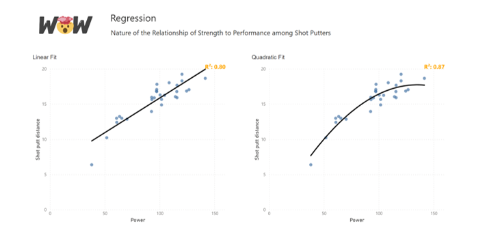
Introduction This week for Workout Wednesday we are getting familiar with the PlotlyJS visual by creating traces and annotations for a connected scatterplot.   Connected scatterplots are a cross between a scatterplot and a lineplot whereby two numeric variables are connected by a third ordered variable (often time).   The below graph created with the …

2022 Week 31 | Power BI: Connected Scatter with PlotlyJS Read More »