2026 Week 14 | Power BI: Drive insights with a simple table
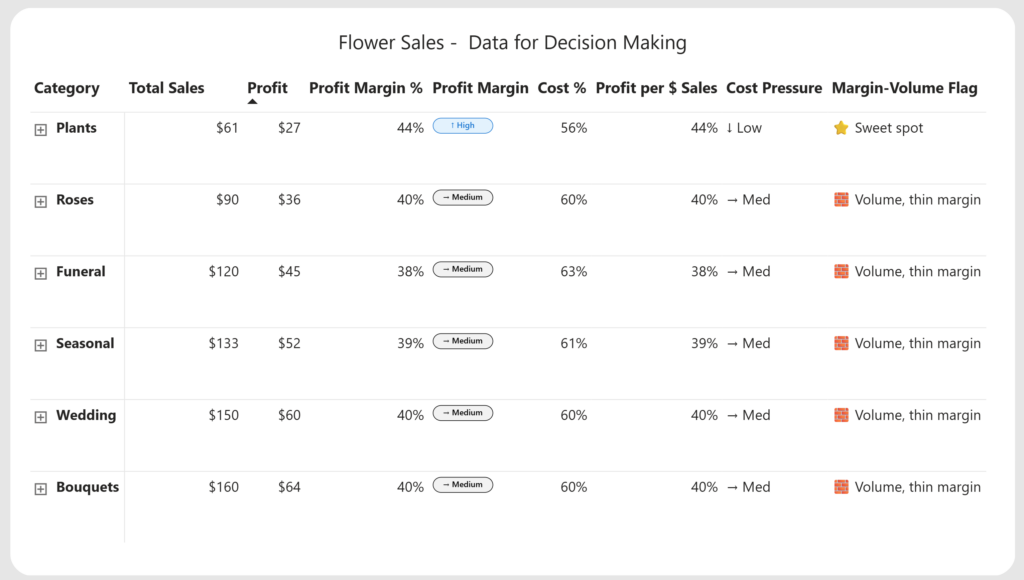
Introduction This week we’re going to build everyone’s favorite Power BI visual, a table! Tables are often dismissed as boring or “not visual enough,” but they’re also one of the most powerful tools we have for making decisions – when they’re designed with intent. In this workout, we’ll start with a very simple table […]
2026 Week 14 | Power BI: Drive insights with a simple table Read More »
Power BI, Workout Wednesday