2026 Week 9 | Sigma: Do you ship it?
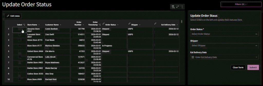
Introduction Welcome to Week 9 of 2026! This week, we’re going to explore using a form to bulk update multiple rows of an input table. As a bonus, we will also play with custom sorting controls. Good luck! -Ashley Need access to Sigma? Click Here to Sign Up Link to WOW Sigma Instance Youtube Click […]
2026 Week 9 | Sigma: Do you ship it? Read More »