Introduction
Welcome to Week 21 of 2025!
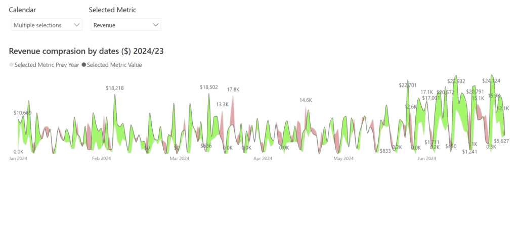
This report allows users to select a performance metric (e.g., Revenue) and compare its values across 2024 and 2023. It provides a flexible way to explore year-over-year changes and spot trends or anomalies through interactive visuals.
Good luck!
-Andrei
Requirements
Main Visual:
Area Chart with Year-on-Year Comparison
Green Area: Metric value is higher in 2024 than in 2023
Red Area: Metric value is lower in 2024 than in 2023
X-Axis: Dates (adjusts based on selected months)
Y-Axis: Selected Metric Value (e.g., $ Revenue)
Dynamic Behavior:
Visuals update automatically when a new metric or date range is selected
The chart clearly highlights where 2024 performance exceeds or lags behind 2023
Clean tooltips and labels show exact values at key points
Finishing Touches
Customizable title: Automatically updates based on selected metric
Optimized model structure for fast refresh and low latency
Slicers synced across all visuals for consistent analysis context
Share Your Work
Inspired by the Workout Wednesday approach, this dashboard supports easy storytelling and collaboration.
Share your version with hashtags like #WOW2025 and #PowerBI.
Dataset
Find this week’s dataset in Excel at: Workspaces / Workout Wednesday / 2025 / 2025W21 – Sales
Share
After you finish your workout, share on social media using the hashtags #WOW2025 and #PowerBI. Tag me (Andrei) on LinkedIn, along with Meagan, Kerry, and Shannon.
On Bluesky, tag @mmarie.bsky.social, @shan-gsd.bsky.social, and @merrykerry.bsky.social.