2026 Week 25 | Power BI: Find the difference from a selected value
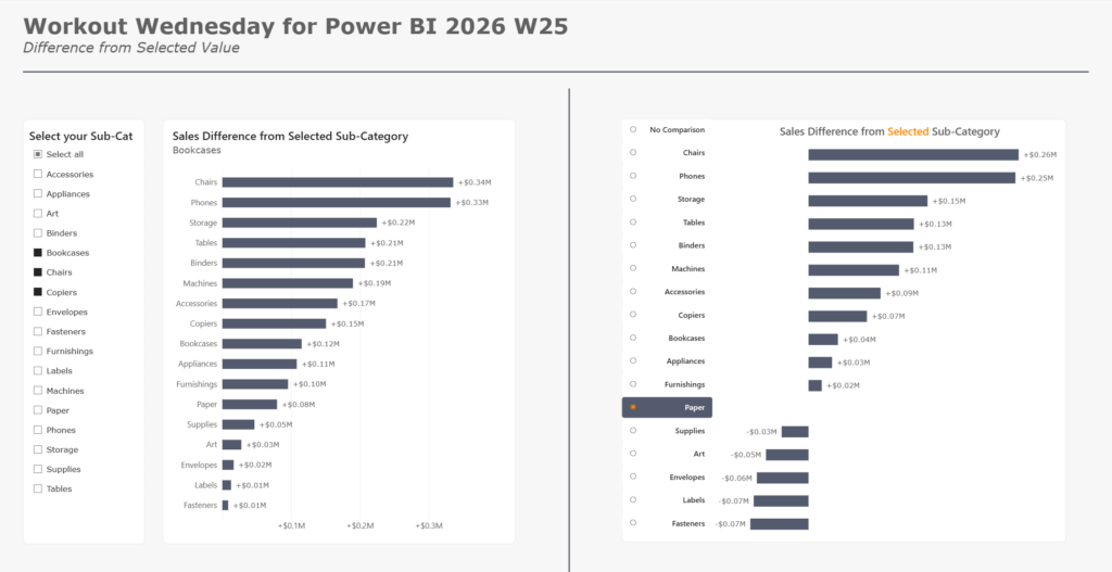
Introduction We have a new contributor to WoW for Power BI, Robbin Vernooij. Please check out Robbin’s challenge below, including the solution video! ⬇️ This week we’re looking to give our users the capability to select which sub-category they want to use as a comparison value for all others! This technique has many different use […]
2026 Week 25 | Power BI: Find the difference from a selected value Read More »
Power BI, Workout Wednesday