2025 Week 35 | Grouped Field Parameters in a Matrix
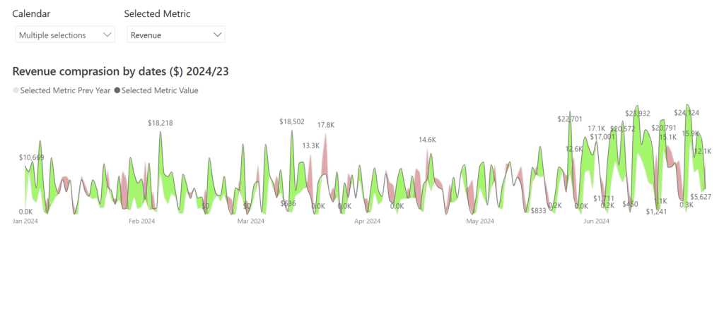
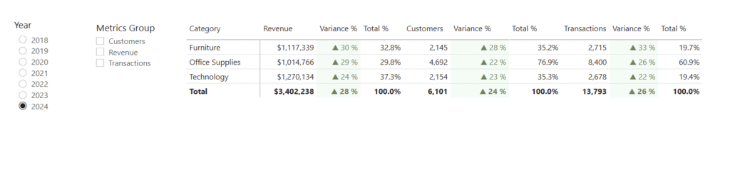
Introduction Welcome to Week 35 of 2025! When building reports in Power BI, one of the most common requests I hear from users is: “Can I explore different KPIs side by side without creating dozens of visuals?” The good news: yes, you can! And it’s cleaner than ever with field parameters grouped by category. In […]
2025 Week 35 | Grouped Field Parameters in a Matrix Read More »