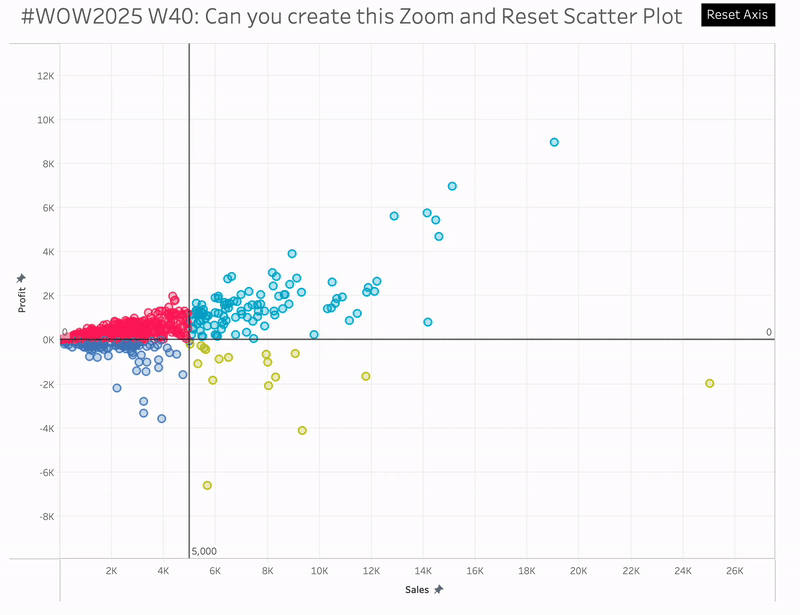
#WOW2025 | Week 40 | Can you create this Zoom and Reset Scatter Plot?
Introduction I had a thought last week about using the parameter driven axis ranges and whether they could be reset to the minimum and maximum. Turns out they can be, and hence this challenge. Click to open in Tableau Public Requirements 1 sheet You’ll need: 4 parameters 4 LODs 1 colour calc (reference lines are […]
#WOW2025 | Week 40 | Can you create this Zoom and Reset Scatter Plot? Read More »