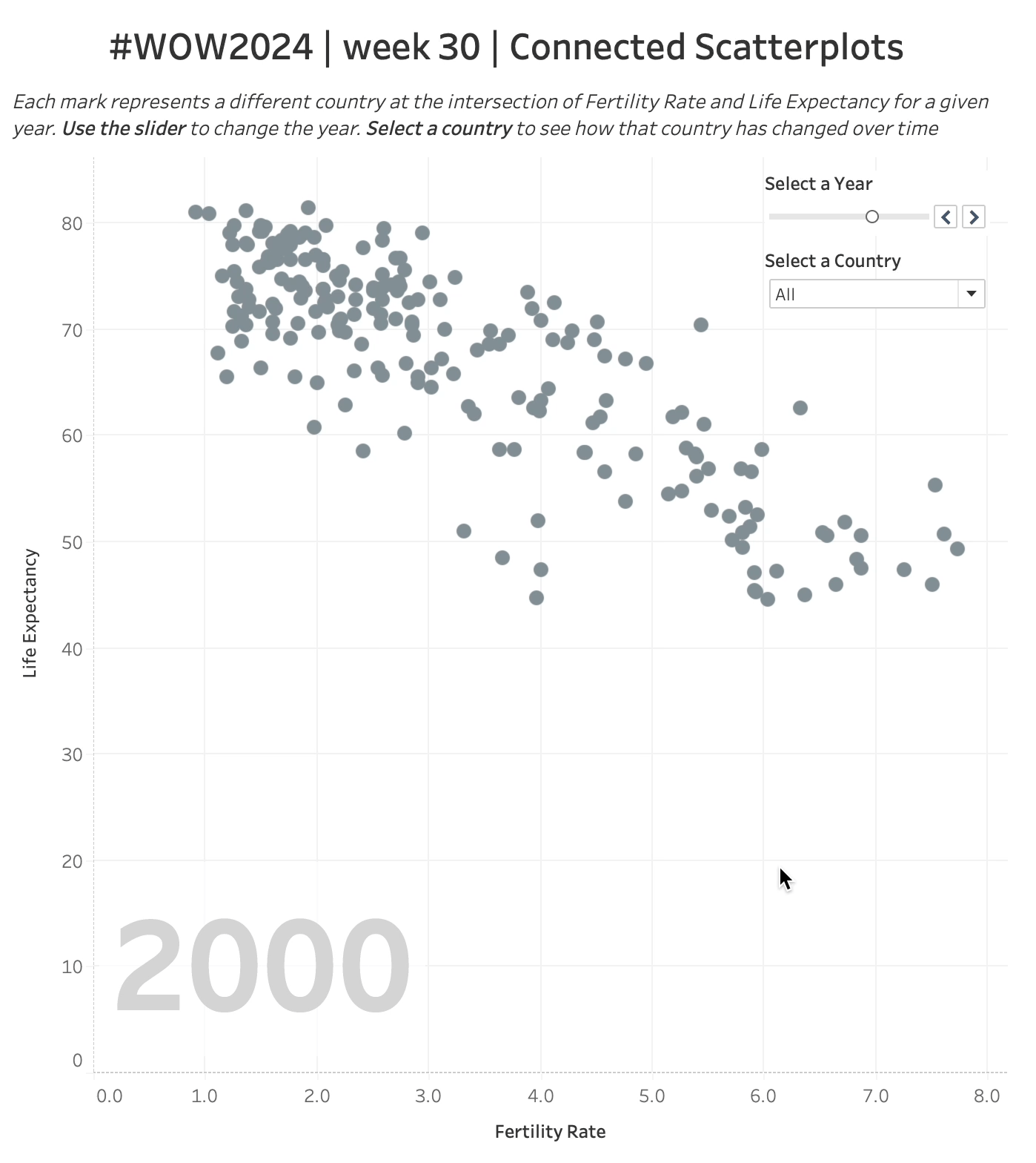
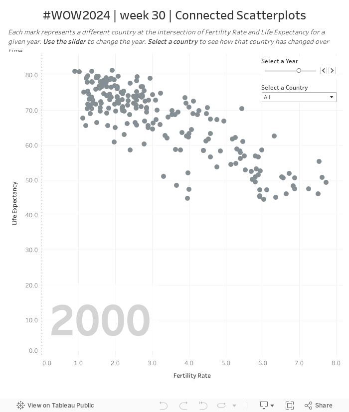
It’s no surprise that many analysts tend to enjoy looking at data via a scatterplot. It’s a great way to show correlation across two measures for a cohort of dimensions. Additionally, one of the most popular charts of all-time is a line chart which shows historical trends. So how we do show correlation of two measure over time? Well one option is a combination line chart with a lines per measure. This chart type is quite popular but a more interesting option is, of course, the connected scatterplot.
That’s what this challenge is going to focus on. But we’re going to follow data viz best practices and only going to connect the right dots at the right time (when the user wants to)
Create a scatterplot that shows the Fertility Rate and Life Expectancy for each country for the selected year
When a country is selected show the connected trend line of each year’s values
Show the selected year in the lower left quadrant
Label the line’s the first and most recent year
Label the selected country when clicked
Match formatting, tooltips and interactivity
Dataset
This challenge uses a custom dataset from Gapminder. I grabbed and shaped the data for you. You can grab a copy of the csv on my github here.
Attribute
When you publish your solution on Tableau Public make sure to take the time and include a link to the original inspiration. Also include the hashtag #WOW2024 in your description to make it searchable!