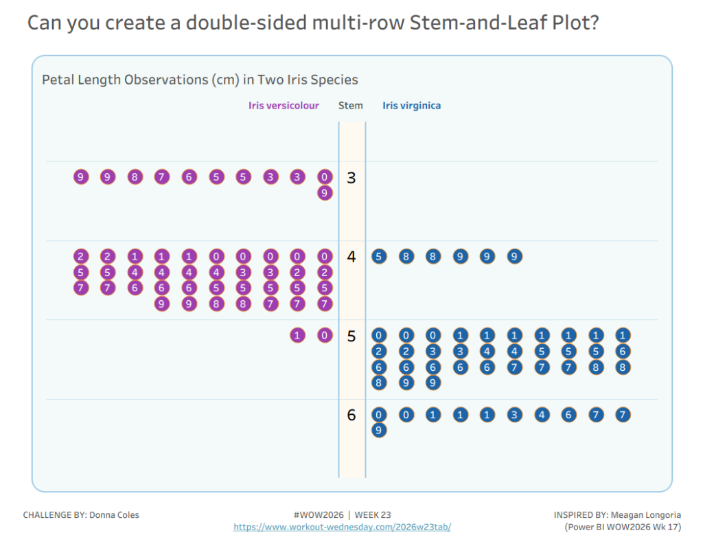
Donna Coles

#WOW2025 | Week 44 | Can you build a satellite chart to represent values exceeding 100%?

Introduction Some time ago the brilliant Sam Parsons, developed a “Satellite” or “Spiral” Chart as an alternative way to visualise a donut that exceeded 100%.https://public.tableau.com/app/profile/sparsonsdataviz/viz/SpiralingSatelliteCharts/SpiralingSatelliteCharts. As with many things Sam comes up with, I always want to see if I can build it, and once again it’s a great excuse for a #WOW challenge. Back …

#WOW2025 | Week 44 | Can you build a satellite chart to represent values exceeding 100%? Read More »

#WOW2025 | Week 31 | Can you build an alternative to a stacked bar chart?

Introduction I often use the #datafam community as inspiration for my #WOW challenges, as it gives me the perfect opportunity to try out a particular technique or visualisation style, which I hope you all then benefit from too 🙂 This week’s challenge was inspired by this blog post by the Flerlage Twins, which in turn …

#WOW2025 | Week 31 | Can you build an alternative to a stacked bar chart? Read More »

#WOW2025 | Week 3 | How are EPL Football Teams performing this season compared to previous seasons?

Introduction This week’s challenge has 3 levels which I hope means there’s something for everyone – whether you’re new to Tableau and #WorkoutWednesday or a seasoned veteran 😉  If I’ve implemented things correctly, it should be possible to simply build on from the Beginner Level requirements without having to rework anything too much to get …

#WOW2025 | Week 3 | How are EPL Football Teams performing this season compared to previous seasons? Read More »

#WOW2024 | Week 31 | How do you compare against the world’s best 100m runners?

Introduction The 33rd Summer Olympic Games started in Paris last week, so we have an Olympic themed challenge this week, and I hope this is a fun one. When researching ideas, I saw this viz on my colleague, James Newton’s (Twitter|X / Linked In ), Tableau Public profile and thought it would be good fun to …

#WOW2024 | Week 31 | How do you compare against the world’s best 100m runners? Read More »

#WOW2024 | Week 24 | Can you visualise headcount distribution in multiple ways on a single sheet?

Introduction For this week’s challenge I want to see if you can provide users with the flexibility to choose how they want to display a particular metric – in this case we’re looking at Headcount data, and how it is distributed across different employee attributes. Depending on the question being asked, a particular layout might …

#WOW2024 | Week 24 | Can you visualise headcount distribution in multiple ways on a single sheet? Read More »