2024 Week 42 | Power BI: Scatter Plot Dynamic Colour Density
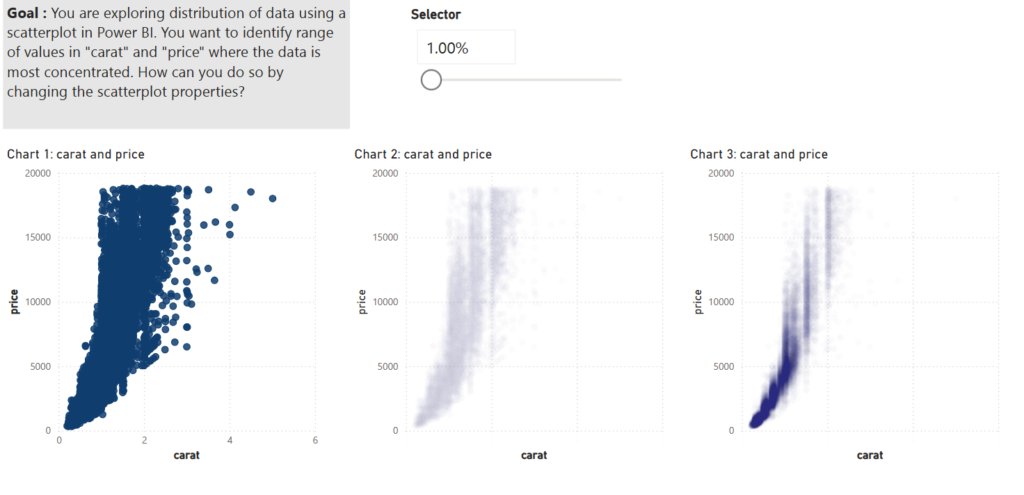
Introduction Scatterplots are one of the most useful visual chart types for data exploration. You can use them to identify relationships among two or more variables, find clusters of data, encode data in several ways for communicating insights etc. This is especially useful when working with large datasets. In this WoW challenge, our goal is to use marker […]
2024 Week 42 | Power BI: Scatter Plot Dynamic Colour Density Read More »