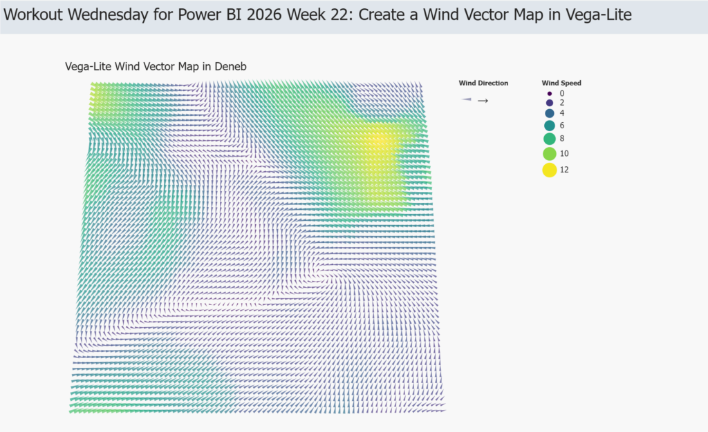
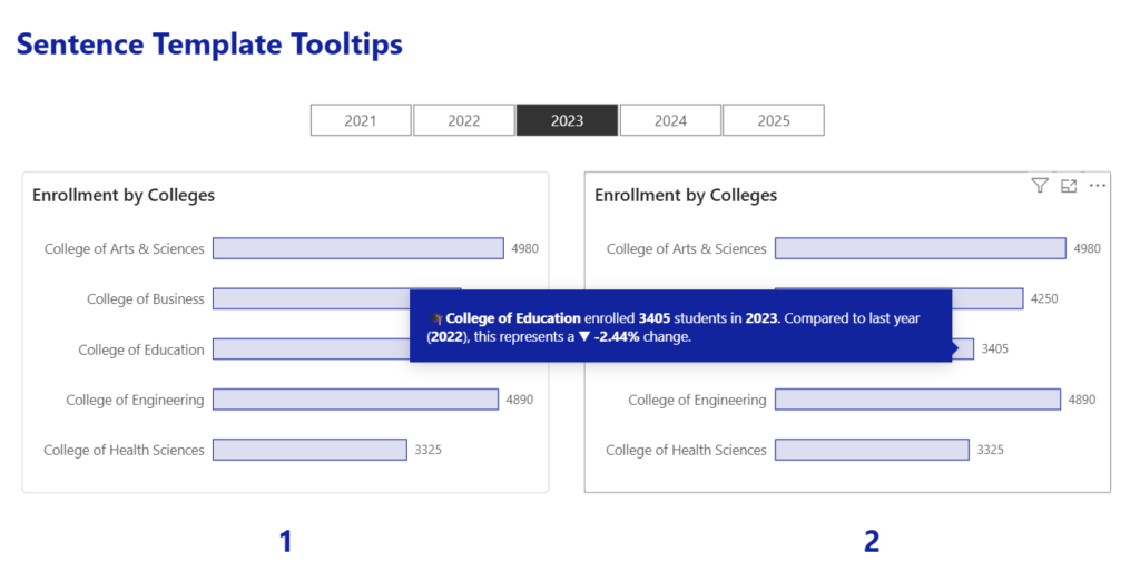
Power BI

2026 Week 16 | Power BI: Recreate the Tableau Satellite Chart

Introduction This week, we are making a Power BI version of a previous Tableau challenge by Donna Coles. We are making small multiple spiral charts, also called satellite charts. Satellite charts can be used to show percentages when values exceed 100%. Rather than creating one circle like a donut chart, the line spirals out to […]

2026 Week 16 | Power BI: Recreate the Tableau Satellite Chart Read More »

Week 15

2026 Week 15 | Power BI: Exploring and Enhancing the new Theme

Introduction In this week’s challenge we are exploring the new Power BI Theme that is in Preview : https://powerbi.microsoft.com/en-us/blog/deep-dive-into-modern-visual-defaults-and-customizing-theme-improvements-preview/   The new theme comes with new chart defaults and additional Style Presets.   The challenge is to set your own defaults by downloading the JSON Theme file and modifying it.   You can use a

2026 Week 15 | Power BI: Exploring and Enhancing the new Theme Read More »

2026 Week 14 | Power BI: Drive insights with a simple table

Introduction   This week we’re going to build everyone’s favorite Power BI visual, a table! Tables are often dismissed as boring or “not visual enough,” but they’re also one of the most powerful tools we have for making decisions – when they’re designed with intent. In this workout, we’ll start with a very simple table

2026 Week 14 | Power BI: Drive insights with a simple table Read More »

2026 Week 12 | Power BI: Custom matrix subtotals and cards with categories

Introduction This week we are looking at some newer core visuals and formatting features: cards that in a segmented tile layout, a slicer that supports partial text matching, and a matrix where the percentage-of-total calculation changes meaning depending on whether you’re looking at a subtotal or a detail row.  The bonus challenge pushes into SVG-in-DAX

2026 Week 12 | Power BI: Custom matrix subtotals and cards with categories Read More »

2026 Week 10 | Power BI: Dynamic visibility of visuals

Introduction This challenge focuses on a powerful Power BI technique: conditional visibility using overlapping visuals and dynamic transparency. Instead of hiding visuals entirely, you’ll learn to control visibility through background color transparency – making elements appear and disappear based on user selections. Based on the selection of countries, we are looking at differences in foreign

2026 Week 10 | Power BI: Dynamic visibility of visuals Read More »

2025 Week 51 | Power BI: Holiday Traffic: Who Came, Who Left 🎄

Introduction The first snowfall in Denver was unseasonably late this year. So I got curious about the data and decided to make a visualization. While this one does communicate with data, it’s taking a bit of artistic license.  This is your challenge as well: create a first snowfall scatterplot with some wintery visual effects. You

2025 Week 51 | Power BI: Holiday Traffic: Who Came, Who Left 🎄 Read More »

2025 Week 49 | Power BI: Join the last QuickViz Challenge

Introduction Welcome back to Workout Wednesday! This week we’re partnering with the Fabric Community team for their final QuickViz challenge! The idea is simple: create a single visual, upload the .pbix to the Fabric Community, and browse the other entries to see what you can learn!   Read more about the challenge in the Fabric Community. Let’s

2025 Week 49 | Power BI: Join the last QuickViz Challenge Read More »

2025 Week 48 | Power BI: Build a stream graph

Introduction Welcome back to Workout Wednesday! This week we’re building a stream graph in Power BI! A stream graph is a variation of the stacked area chart that arranges categories so they flow above and below a central baseline. This creates a smooth, organic “stream” appearance. Stream graphs are excellent for visualizing how many categories change over time

2025 Week 48 | Power BI: Build a stream graph Read More »