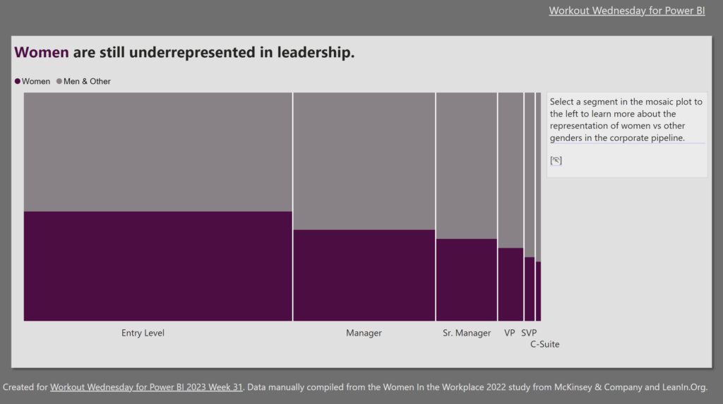
Meagan Longoria

2023 Week 09 | Power BI: Create a table with custom and built-in microcharts

Introduction This week we are making a table with microcharts (sparklines). Power BI does offer built-in sparklines, but sometimes we want formatting options not available with the defaults. Our challenge this week uses both the built-in sparklines and custom SVG images in a table. Requirements Create a custom column with the following logic: If the …

2023 Week 09 | Power BI: Create a table with custom and built-in microcharts Read More »

Area charts with layered series

2023 Week 02 | Power BI: Create layered line/area charts with labels and annotations

Introduction For our second week of Workout Wednesday 2023 Power BI Edition, we are taking inspiration from a recent Washington Post interactive story titled “See just how bad a year it was for your retirement account — and why”. The article looks at the closing price of the S&P 500, comparing the value at the …

2023 Week 02 | Power BI: Create layered line/area charts with labels and annotations Read More »

Error Bars showing standard deviation from the average

2022 Week 39 | Power BI: Use error bars to show statistical ranges

Introduction We first looked at error bars in week 28. But error bars have several formatting features and can be used in several types of visuals. This week, we are going to use error bars to show a dynamically populated range around an average.  Requirements Calculate the average height and standard deviation for the heights. …

2022 Week 39 | Power BI: Use error bars to show statistical ranges Read More »

Screenshot from Power BI Workout Wednesday 2022 Week 18

2022 Week 18 | Power BI: Remake this Tableau budget burndown chart

Introduction For the month of May, we are remaking Tableau visualizations with Power BI. Although the visuals made by the two tools may be similar, the calculations and formatting options are a bit different. This makes some things easier in one tool compared to the other. If you use both Power BI and Tableau, feel …

2022 Week 18 | Power BI: Remake this Tableau budget burndown chart Read More »

Power BI Report containing Demeb bullet charts

2022 Week 13 | Power BI: Build a Bullet Chart with Deneb

Introduction For this last week of March, we are continuing our project management theme.  The challenge this week is to use Deneb to build bullet charts using the provided data. Bullet charts were created by Stephen Few to offer an alternative to clunky gauges. Bullet charts are used to compare a featured measure to one or …

2022 Week 13 | Power BI: Build a Bullet Chart with Deneb Read More »