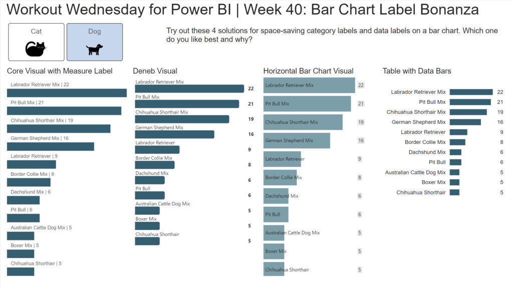
Meagan Longoria

2022 Week 35 | Power BI: Make a Comet Chart

Introduction This week we are exploring another lesser used chart type: the comet chart. Comet charts show the evolution of one or two measures over time. They allow you to see change between two time periods across a category while emphasizing the direction of the change. You might use a comet chart instead of a dumbbell …

2022 Week 35 | Power BI: Make a Comet Chart Read More

2022 Week 24 | Scatterplot with custom marker

Introduction For this workout, we are visualizing data in a scatterplot in a bit of a non-traditional manner. This week marks 26 years since Ella Fitzgerald, the “Queen of Jazz”, passed away. So we are visualizing melodies to a few of her songs. My approach is a bit abstract – not quite sheet music but …

2022 Week 24 | Scatterplot with custom marker Read More

Screenshot from Power BI Workout Wednesday 2022 Week 18

2022 Week 18 | Power BI: Remake this Tableau budget burndown chart

Introduction For the month of May, we are remaking Tableau visualizations with Power BI. Although the visuals made by the two tools may be similar, the calculations and formatting options are a bit different. This makes some things easier in one tool compared to the other. If you use both Power BI and Tableau, feel …

2022 Week 18 | Power BI: Remake this Tableau budget burndown chart Read More

Power BI Report containing Demeb bullet charts

2022 Week 13 | Power BI: Build a Bullet Chart with Deneb

Introduction For this last week of March, we are continuing our project management theme.  The challenge this week is to use Deneb to build bullet charts using the provided data. Bullet charts were created by Stephen Few to offer an alternative to clunky gauges. Bullet charts are used to compare a featured measure to one or …

2022 Week 13 | Power BI: Build a Bullet Chart with Deneb Read More

Power BI Parallel Sets

2022 Week 07 | Power BI: Parallel Sets

Introduction Welcome to week 7 of Workout Wednesday for Power BI 2022. We are again using the Data Visualization Society‘s annual State of the Industry survey results.  This week we are looking at how we can visualize parallel sets. Although this may not be a visual that we use often, it can be very useful for multivariate analysis. …

2022 Week 07 | Power BI: Parallel Sets Read More

Line chart with vertical reference line

2022 Week 03 | Power BI: Can you visualize percent difference from a selected date?

Introduction This week we are taking a page from the Tableau team and looking at how a metric has changed from the value at a specified reference date.  Requirements Create a line chart showing percent change of the close price from a selected date.  Use a slicer or other visual to allow users to change …

2022 Week 03 | Power BI: Can you visualize percent difference from a selected date? Read More

Power BI Advent Calendar

2021 Week 49 – 51 | Power BI: Advent Calendar with Holiday Challenges

Introduction As holiday season is upon us, we have created a Power BI Advent Calendar for you to enjoy. Select each day to open a surprise. The surprise for each day will not be available until we reach that day (in UTC time). If you try to open a gift before we have reached the …

2021 Week 49 – 51 | Power BI: Advent Calendar with Holiday Challenges Read More

A power bi report that calculates contrast ratio between two colors

2021 Week 46 | Power BI: Create a Color Contrast Calculator

Introduction This week we are continuing our design theme by making a report about report design. Color is a very important element in report design. Color contrast is not only important for accessibility, it’s also an element of visual hierarchy. You can also use color contrast as a way to make elements on your report …

2021 Week 46 | Power BI: Create a Color Contrast Calculator Read More

Power BI report showing Dutch Bros coffee locations within a radius of a selected city

2021 Week 43 | Power BI: Maps with a Distance Radius

Introduction It’s the final week of mapping month! This week we are plotting points on a map within a selected radius. It’s common to want to see locations, such as stores or restaurants that are nearby to a selected location. This week we are exploring one way to do that in Power BI. This involves …

2021 Week 43 | Power BI: Maps with a Distance Radius Read More

Scroll to Top