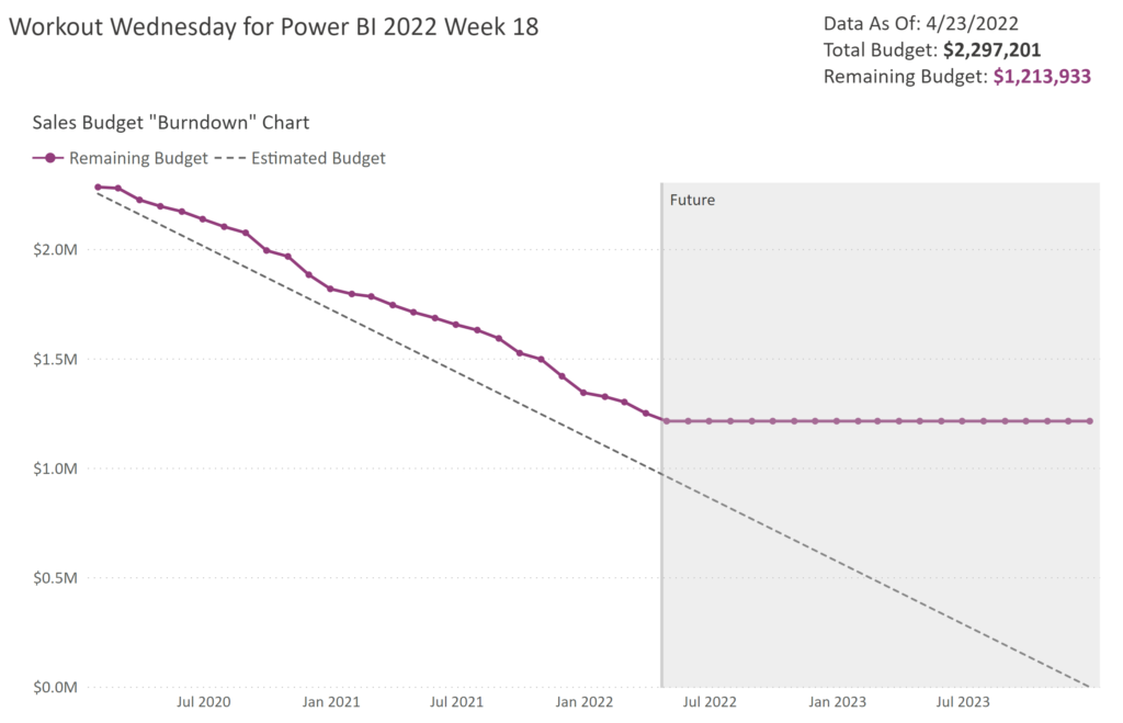
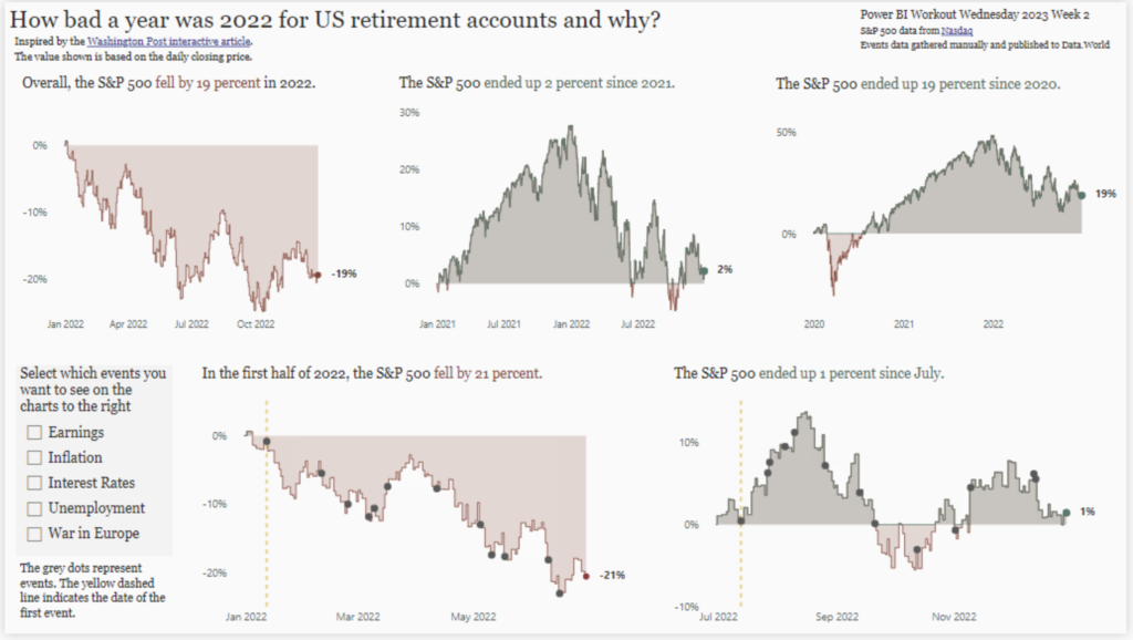
Meagan Longoria

Power BI report showing Dutch Bros coffee locations within a radius of a selected city

2021 Week 43 | Power BI: Maps with a Distance Radius

Introduction It’s the final week of mapping month! This week we are plotting points on a map within a selected radius. It’s common to want to see locations, such as stores or restaurants that are nearby to a selected location. This week we are exploring one way to do that in Power BI. This involves …

2021 Week 43 | Power BI: Maps with a Distance Radius Read More

Power Bi report with a line chart and map

2021 Week 40 | Power BI: Geocoding and Maps

Introduction We have declared October to be mapping month! This month, we will focus on maps and geospatial data. There are several different maps available in Power BI as default and custom (AppSource) visuals. This week we are going to start off simple and use the Map visual to make a bubble map.  When visualizing …

2021 Week 40 | Power BI: Geocoding and Maps Read More

Wow 2021 PBI Week 30 Power BI report

2021 Week 30 | Power BI: Remove Punctuation and Count Words With Power Query

Introduction To celebrate our fourth week of Power Query month, we are going to use Power Query to analyze text data. Inspired by Chris Webb’s blog post, we are going to analyze word usage in Mary Wollstonecraft Shelley’s Frankenstein; Or, The Modern Prometheus. The Power Query techniques used in this week’s challenge are a bit …

2021 Week 30 | Power BI: Remove Punctuation and Count Words With Power Query Read More

Power Bi 2021 week 26 showing a histogram with 8 even bins

2021 Week 26 | Power BI: Make a Histogram with Equal Size Bins

Introduction This is our last week using the Nobel Prize data. We are again looking at the age of the laureate when they were awarded the prize. This time we will examine it using a histogram. Histograms measure the distribution of data within defined ranges. So we are calculating age and creating bins of equal …

2021 Week 26 | Power BI: Make a Histogram with Equal Size Bins Read More

Isotype visual showing female Nobel prize winners

2021 Week 24 | Power BI: Create an Isotype Visualization

Introduction This week we are continuing with the Nobel laureates data and taking a look at gender diversity of Nobel laureates. We’ll do this by using an isotype visualization. Isotype visuals use an icon that is related to the subject matter being depicted and often use multiples to represent quantitative data. You can learn more about …

2021 Week 24 | Power BI: Create an Isotype Visualization Read More

2021 Week 22 | Power BI: Create Your Own Timeline from JSON Data

Introduction Workout Wednesdays for Power BI is now in our sixth month! Thanks so much for joining us. For the month of June, we will have independent exercises that all use the same data source but focus on different aspects of the data and of Power BI. Our dataset for the month comes from Nobelprize.org. …

2021 Week 22 | Power BI: Create Your Own Timeline from JSON Data Read More

Start Screen for the Cat or Croissant Game

2021 Week 18 | Power BI: DAX Trick – Cat or Croissant

Introduction The Power BI Workout Wednesday team has decided that May is made for DAX! Each challenge this month will require some DAX in the solution.  We are going to start our month of DAX with a fun game called Cat or Croissant. You might be familiar with the many versions of “animal or food” …

2021 Week 18 | Power BI: DAX Trick – Cat or Croissant Read More

2021 Week 10 | Power BI: Violin Plot Custom Visual

Introduction Thanks for joining us for Week 10 of Workout Wednesday – Power BI Edition.  This week our challenge is to use the Violin Plot custom visual. There are no dependencies on prior weeks for this workout, so feel free to jump right in.  Custom visuals are additional visuals created by Microsoft and Microsoft partners …

2021 Week 10 | Power BI: Violin Plot Custom Visual Read More

Scroll to Top