2025 Week 23 | Power BI: Highlight on Hover with Deneb
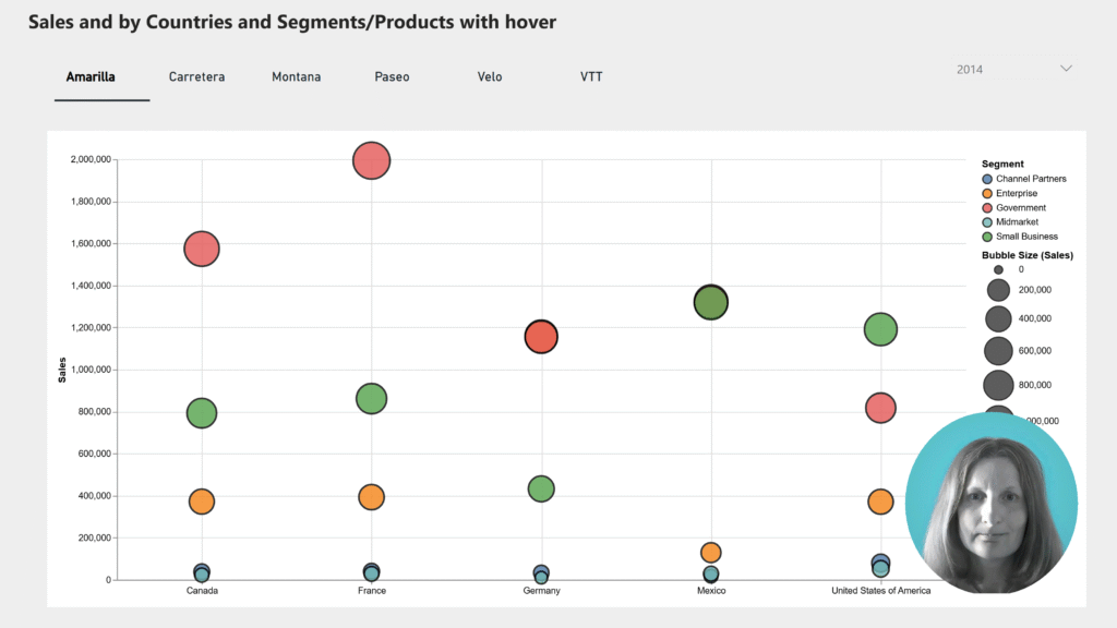
Introduction What do you want to highlight on hover? Practice with the Deneb Custom Visual. This week’s challenge was created using the Deneb custom visual in Power BI. I was inspired by the many examples on the Vega-Lite website. The chart displays Sales and Profit grouped by country and segment, based on a sample Power …
2025 Week 23 | Power BI: Highlight on Hover with Deneb Read More