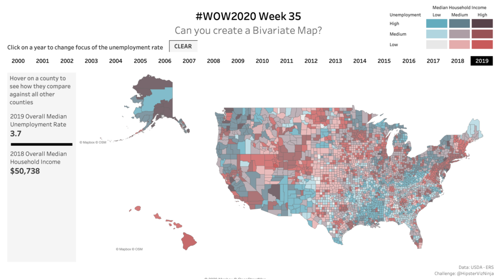
Month: August 2020

2020 Week 34: Can you show all the crimes within X miles of Y Point?

Introduction This week, I thought I would do a throwback to a speed tipping session I did in Vegas at Data19. This is using some of the cool spatial techniques. I like to think of this as a target chart, as that’s what it creates. Click to open in Tableau Public Requirements Dashboard Size: 800px …

2020 Week 34: Can you show all the crimes within X miles of Y Point? Read More

2020 Week 33: Is Profit Ratio Influenced by Quantity?

Introduction This year it seems like most of my favorite dashboards are some version of a scatterplot.  I’ve always loved the scatterplot since it is such an elegant way to show two measures at once and perfect for unearthing relationships among measures.  So for this week’s challenge, I thought I’d make one with a slight …

2020 Week 33: Is Profit Ratio Influenced by Quantity? Read More

Scroll to Top