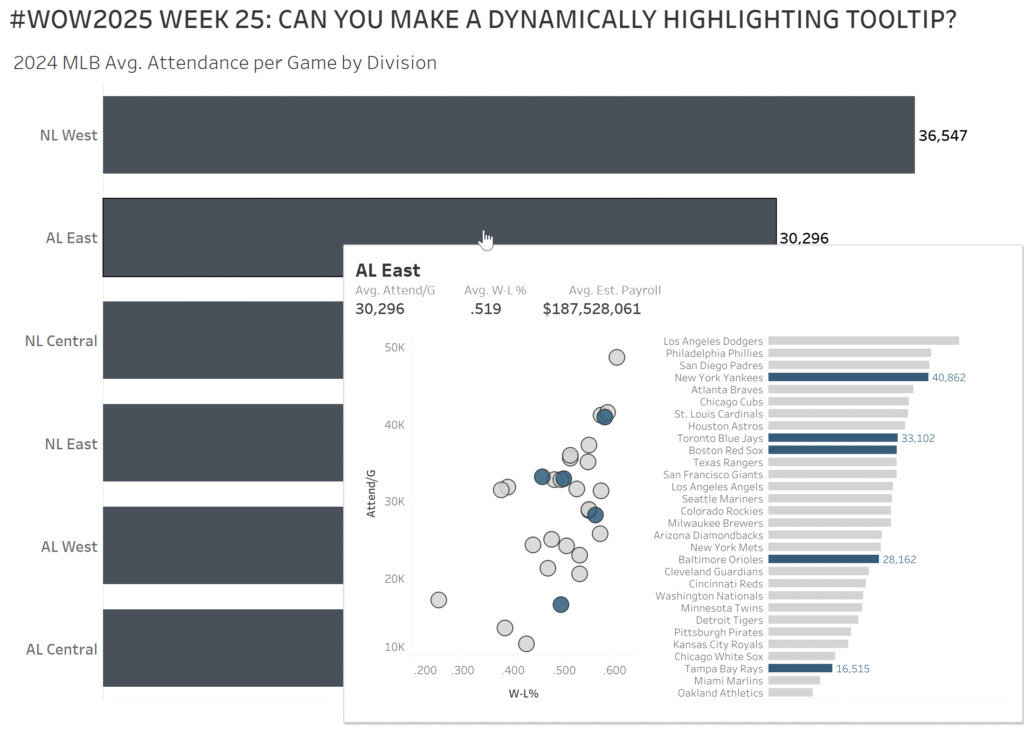
Kyle Yetter

#WOW2024 | Week 8 | Can you create an area chart tile map?

Introduction While reviewing recent work I’ve done in preparation for this week’s challenge, I came across a tile map with individual area charts by state that we use to monitor subscriptions, and thought it would be a fun one. As I dug into it, I realized it was inspired by Luke’s challenge in 2020 Week …

#WOW2024 | Week 8 | Can you create an area chart tile map? Read More

#WOW2024 | Week 2 | Can you create a time-focused Gantt Chart?

Introduction This week’s challenge is another from recent experience. As we have spikes or drops with various metrics, we found that we often asked the same questions…What marketing campaigns were happening at that time? Did we send any big email campaigns around then? Did we launch a new product feature or experiment? With all these …

#WOW2024 | Week 2 | Can you create a time-focused Gantt Chart? Read More

#WOW2023 | Week 48 | Can you add candlesticks to bar charts?

Introduction As we finish up Global Recognition Month, I’d like to introduce you to Shunta Nakajima (@Dandee_House), a BI Engineer from Japan who has been a regular participant in #WOW2023 challenges.  Over to you Shunta…. [JP] 私がWorkoutWednesdayを知ったのが2020年、それ以来約3年間多くのチャレンジに取り組み、非常にたくさんのことを学ぶことができました。WOWのおかげで、私のTableauスキルを向上させることができました。今回、ゲストとして私のチャレンジを紹介できることになり、非常にワクワクしています。 Kyle,どうもありがとう! さて、今回のチャレンジでは私の大好きなチャートタイプの1つである、棒グラフとローソクの組み合わせを題材にしました。 私が初めてこのチャートタイプを知ったのは、かつてこのWOWを立ち上げ、またもう一つの素晴らしいコミュニティイベントであるMakeoverMondayを最近まで主宰していたAndy KriebelさんのVizです。 彼の表現方法を一目見て「すごく良いな」と思い、私も自身が作るVizのいくつかに取り入れるようになりました。 このチャートタイプの作成方法について詳細を知りたい場合は、彼のYoutube動画 を参照ください。 また、チャレンジには私がWOWを通して学んだいくつかのテクニックも盛り込んでいます。 それでは楽しんでください! [EN] The first time I came across WorkoutWednesday was …

#WOW2023 | Week 48 | Can you add candlesticks to bar charts? Read More

#WOW2023 Week 42 | Can you proportionally brush from multi-selection?

Introduction This week’s challenge is another inspired by my everyday work. As we launch new features, we look at how different segments of users engage with them. We wanted a smooth way to click into the segment combinations that were of interest, without having to go back to the top to change a bunch of …

#WOW2023 Week 42 | Can you proportionally brush from multi-selection? Read More

#WOW2023 Week 36: Can you build a dashboard for pre-aggregated metrics?

Introduction Recently, I needed to build a dashboard from some pre-aggregated, segmented data counting unique users. This created some difficulty, because we may want to look at overall numbers, or one segment, or multiple segments, and that changes the user counts. Each of these have their own level of aggregation in the data, so it …

#WOW2023 Week 36: Can you build a dashboard for pre-aggregated metrics? Read More

Scatterplot of profit on Y Axis and sales on X Axis, with a dot for each state, colored by profit ratio.

WOW2023 Week 30: Can you build a dynamic drill down scatterplot in one view?

Introduction We’re continuing retro month this week, and I decided to re-viz Andy’s Week 41 challenge from 2017. I chose this one because I really like the concept of being able to drill down from state into city on the same chart, but I wondered if things would be easier than the calculations required to …

WOW2023 Week 30: Can you build a dynamic drill down scatterplot in one view? Read More

#WOW2023 Week 24 | Can you build a mobile KPI app?

Introduction This week’s challenge is another exploration of dynamic zone visibility, this time combined with a mobile app-like concept. Sometimes executives need just a few critical metrics at their fingertips, and this is a concept I’ve mulled around for a while (probably stemming from this concept by Anya A’Hearn) but felt like dynamic zone visibility …

#WOW2023 Week 24 | Can you build a mobile KPI app? Read More

#WOW2023 Week 18: Can you combine relative and custom date filters?

Introduction One of my favorite challenges from the past is from Week 4 2020: Can you combine relative and custom dates? I was always fielding questions if I could have a relative date filter and a date picker on the same dashboard, but hadn’t ever figured it out. After Sean’s challenge that week, I implemented …

#WOW2023 Week 18: Can you combine relative and custom date filters? Read More

#WOW2023 | Week 12 | Can you build a dashboard using containers?

Introduction A few weeks ago I saw this Twitter poll (and the ensuing discussion) about Team Tiled vs Team Floating and I noted that I am neither. Rather, I am Team Container. Using Containers in dashboards makes positioning and sizing everything in your dashboard a piece of cake, once you have mastered how they work. …

#WOW2023 | Week 12 | Can you build a dashboard using containers? Read More

#WOW2023 | Week 6 | Can you create a normalized jitterplot?

Introduction As Donna mentioned last week, this month we’re focusing on alternative chart types. This jitterplot is a fun one inspired by one of Steve Wexler‘s charts in The Big Book of Dashboards. I like jitterplots because they allow you to easily see how an individual compares to the rest of the group via distribution, …

#WOW2023 | Week 6 | Can you create a normalized jitterplot? Read More

Scroll to Top