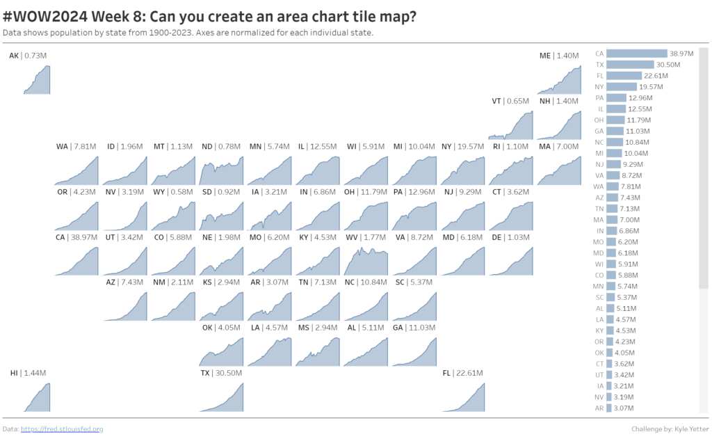
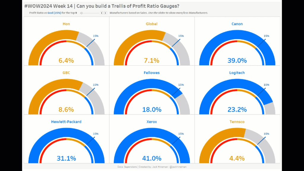
Kyle Yetter

#WOW2023 | Week 6 | Can you create a normalized jitterplot?

Introduction As Donna mentioned last week, this month we’re focusing on alternative chart types. This jitterplot is a fun one inspired by one of Steve Wexler‘s charts in The Big Book of Dashboards. I like jitterplots because they allow you to easily see how an individual compares to the rest of the group via distribution, …

#WOW2023 | Week 6 | Can you create a normalized jitterplot? Read More

#WOW2022 | Week 52 | Can you create a waffle chart?

Introduction What a year 2022 has been! For the last challenge of 2022 we’ll build some waffle charts showing % of sales by segment. Even though I knew the general principle of waffle charts, it was some good practice for me making this one. Hopefully it’ll be some helpful practice for you all as well.  …

#WOW2022 | Week 52 | Can you create a waffle chart? Read More

#WOW2022 | Week 47 | Can you label and sort small multiples?

Introduction Small multiples can be a good way to see overall trends across several categories, but sometimes it can be tricky to get the sorting and labels right, so that’s what we’ll practice this week! Since baseball season is over now, we’ll look at overall win percentage from 1998 to 2022 for Major League Baseball …

#WOW2022 | Week 47 | Can you label and sort small multiples? Read More

#WOW2022 | Week 42 | Can you use Tableau to estimate Aaron Judge’s home run trajectories?

Introduction Hello there, Workout Wednesday #DataFam! This week’s challenge is all about two of my passions growing up: baseball and physics. This past baseball season, New York Yankees outfielder Aaron Judge broke the 61 year old American League record for home runs in a single season set by Roger Maris in 1961 – Judge concluded …

#WOW2022 | Week 42 | Can you use Tableau to estimate Aaron Judge’s home run trajectories? Read More

#WOW2022 Week 37: Can you create a common starting point?

Introduction This week’s challenge is focused on Level of Detail (LOD) calculations. We could probably build this chart using Table Calculations, but we’re not going to. Deliberate practice with some basic LODs. This also can be the basis for some cohort analysis, aligning various groups from different time periods on the same starting point. And …

#WOW2022 Week 37: Can you create a common starting point? Read More

#WOW2022 Week 27: Can you make a bullet chart?

Introduction This week’s challenge is inspired by one of the dashboards in The Big Book of Dashboards, by Steve Wexler, Jeffrey Shaffer, and Andy Cotgreave. If you’re not familiar with it, the BBOD is a tremendous resource of tools and concepts you can apply to real world business scenarios, and you can learn more at …

#WOW2022 Week 27: Can you make a bullet chart? Read More

#WOW2022 | Week 17 | Can you switch between KPIs?

Introduction This week’s challenge is inspired by a Makeover Monday I did a couple years ago, which was inspired by Lindsey Poulter‘s Set Actions workbook. But rather than use the same soccer data, I’m continuing to celebrate the start of baseball season by comparing two Major League Baseball greats.  The overall challenge here is to …

#WOW2022 | Week 17 | Can you switch between KPIs? Read More

Jittered boxplot showing age distribution for MLB teams in 2021

2022 Week 12: Can you create a jittered boxplot?

Introduction Last week a colleague reached out for help creating a boxplot to look at age distribution for different subscription methods, and my first thought was, “I know how to do that, but I don’t remember how to do that.” So I went back to find one I had made previously, and we were able to …

2022 Week 12: Can you create a jittered boxplot? Read More

Scroll to Top