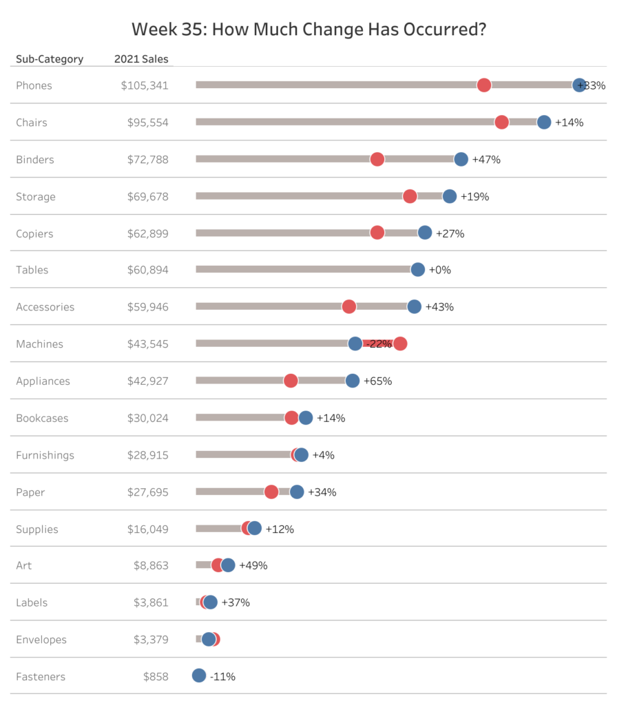
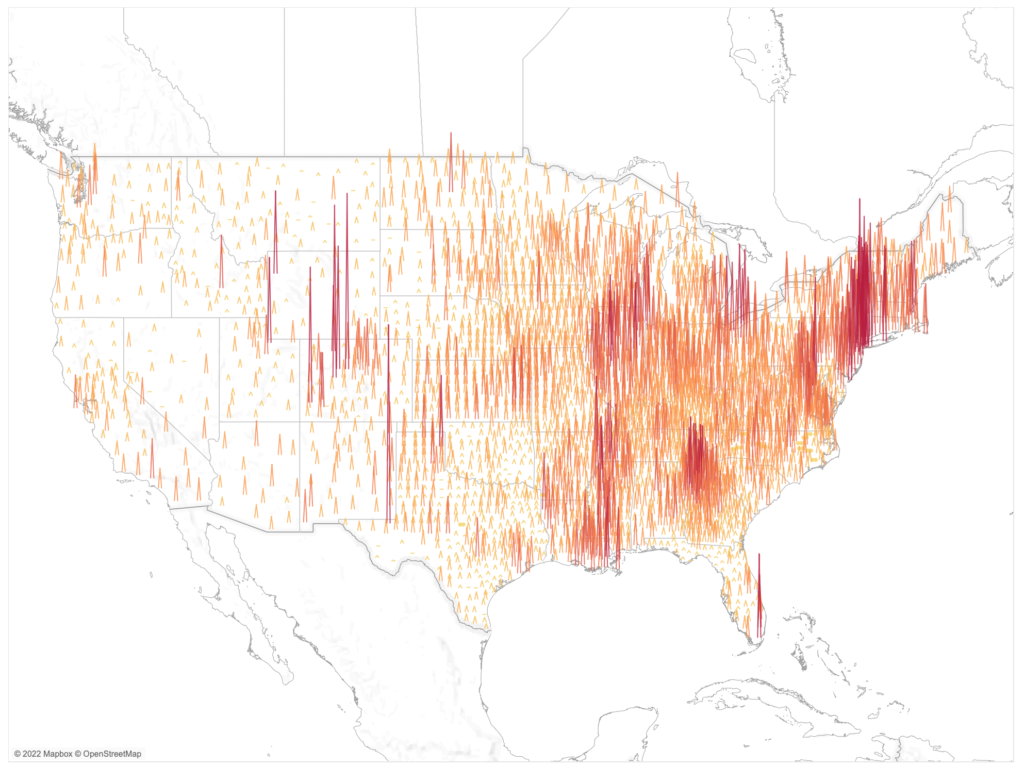
Luke Stanke

2022 – Week 29: What is the Time-Weighted Return?

Introduction Working with financial data is hard. There are some calculations that make for long evenings to get right. One of those calculations is Time-Weighted Return. This challenge is simple: calculate the Time-Weighted Return Rate for a simple data source and return a line chart. Click to open in Tableau Public Requirements Dashboard Size: 400px …

2022 – Week 29: What is the Time-Weighted Return? Read More

2022 – WEEK 24: How is the arctic ice extent trending?

Introduction This week you are invited to build a horizon chart of the arctic ice extent–the amount of ice on the arctic ice cap. Data comes from the National Snow and Ice Data Center. In case you are not familiar with the horizon chart, a nice definition can be found here on Nathan Yao’s Flowing …

2022 – WEEK 24: How is the arctic ice extent trending? Read More

2022 – Week 19: Can you format the dashboard?

Introduction This week the challenge focuses on formatting and your ability to use containers. The goal is to create a near pixel perfect copy of the original. Focus on your use of containers along the way. Click to open in Tableau Public Requirements Dashboard Size: 1100px by 850 px 9 sheets About 7 vertical containers …

2022 – Week 19: Can you format the dashboard? Read More

2022 – Week 14: Can you track headcount?

Introduction This week we are looking at HR headcount data. Headcount data can sometimes seem straightforward to work with, but sometimes the reporting rules can be a bit complicated–particularly with large organizations. This week you will attempt to measure the headcount of a large organization using data from the Real World Fake Data project by …

2022 – Week 14: Can you track headcount? Read More

2022 Week 9: How many patients were admitted every 15 minutes?

Introduction This week we are going to look at hospital admission rates. This data source comes from The Medical Stays dashboard on the Tableau Exchange. This particular challenge is more focused on working with time than it is working with medical data. In this challenge you need to group time into 15 minute increments throughout …

2022 Week 9: How many patients were admitted every 15 minutes? Read More

2022 – Week 4: How have successful products performed?

Introduction This week’s challenge looks at products in Tableau’s superstore dataset. In this challenge you will have to find the products that have been profitable in each of the four years in this dataset. That means profitable in 2018, 2019, 2020, and 2021.  Once you have identified successful products (the consistently profitable products) then you …

2022 – Week 4: How have successful products performed? Read More

WOW2021 – Week 52: Can you build a table with one measure?

Introduction For the last week of 2021 we’ve got a straightforward challenge: create a table with one measure. For fans of the (The Great British) Bake Off note the simple instructions for this technical. Click to open in Tableau Public Requirements Dashboard Size: 1000px by 600 px Match the values in the table using Sales, …

WOW2021 – Week 52: Can you build a table with one measure? Read More

2021 Week 35 – How Much Change Has Occurred?

Introduction September 2021 is community month. Every year since 2018 we’ve invited individuals to share challenges with the community. This year we’ll have some amazing challenges from the Tableau and Power BI communities. But before we get there I’ll be sharing the following challenge: We’ll make a modified dot plot comparing sales for the current …

2021 Week 35 – How Much Change Has Occurred? Read More

2021 Week 34: How Many Consecutive Starts?

Introduction Today I’m excited to share a challenge in collaboration with Dr. Eric Eager at PFF. PFF analyzes data about professional football (in this case the American version). In this game, there are many players, but the most critical player supports a role called the Quarterback. In this challenge you’ll count the number of consecutive …

2021 Week 34: How Many Consecutive Starts? Read More

2021 Week 26 – Tableau: Profitability with Dual Axis Charts

Introduction This week we are going to do two things:  look at alternative for the most common scatterplot I see in Tableau. use a very uncommon unsynchronized dual axis chart. First, the chart I always run into is this scatterplot of total sales and total profit by order. While we can see which orders were …

2021 Week 26 – Tableau: Profitability with Dual Axis Charts Read More

Scroll to Top