2024 Week 21 | Power BI: Use Slicers to Filter a Visual Based Upon a Measure
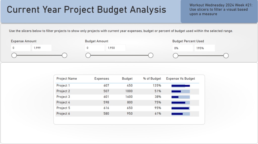
Introduction While you can’t directly populate a slicer with a measure, you can use a slicer to filter other visuals based upon measure amounts. That is what we are doing in this week’s challenge. In the report below, we have a budget analysis report. The report allows users to filter the projects table to projects …
2024 Week 21 | Power BI: Use Slicers to Filter a Visual Based Upon a Measure Read More