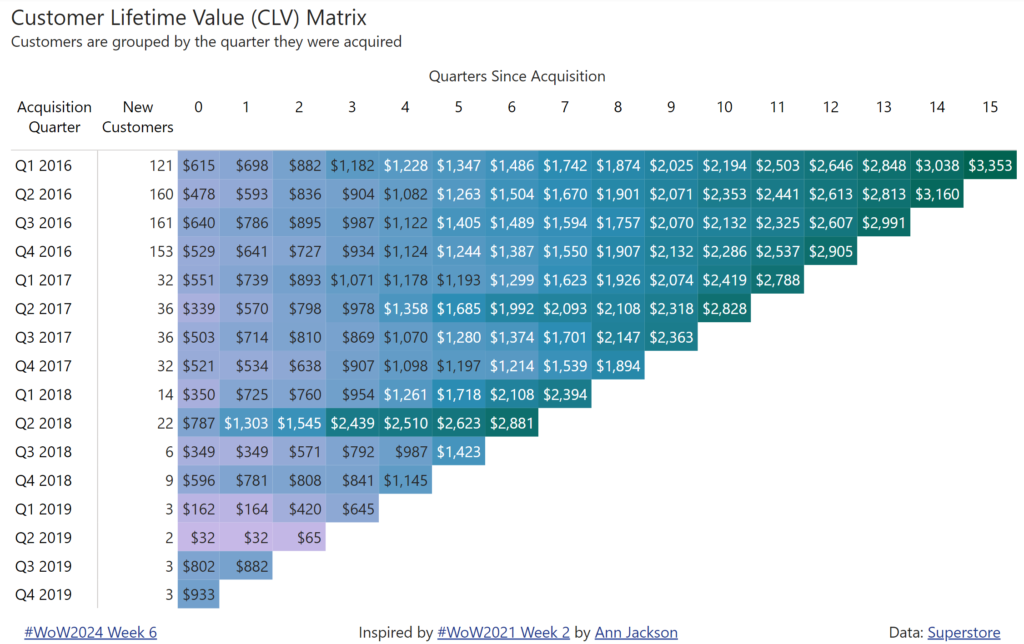
Shannon Lindsay

2022 Week 38 | Power BI: Create a Waterfall Pipeline

Introduction Welcome back to Workout Wednesday! This week we’re collaborating with the Tableau team to create a waterfall pipeline using Salesforce data. Lorna Brown, the creator of the challenge is attending Saleforce’s Dreamforce conference, hence the nature of the challenge. We’re building a waterfall chart using the Simple Waterfall custom visual by Datanomy Limited. This week’s workout can be done in …

2022 Week 38 | Power BI: Create a Waterfall Pipeline Read More

2022 Week 33 | Power BI: Compare two series of values

Introduction Welcome back to Workout Wednesday! This week we’re visualizing two series of values in a take on last week’s Tableau challenge! This week’s challenge uses youth cellphone data and gives you the opportunity to either build a dumbbell chart using Charticulator or to build a lipstick column chart using a custom visual. Complete one or both …

2022 Week 33 | Power BI: Compare two series of values Read More

2022 Week 28 | Power BI: Error Bars

Introduction Welcome back to Workout Wednesday! If you’re joining us for the first time, welcome! We present you with a challenge, a dataset to recreate the challenge, and a solution video or file. You can use these challenges to build your skills and your portfolio! This week we’re exploring the error bars feature in Power …

2022 Week 28 | Power BI: Error Bars Read More

2022 Week 23 | Collab with Preppin Data – Salesforce Opportunities

Introduction Welcome back to Workout Wednesday! This week is our annual collaboration with Preppin’ Data and the Tableau team! This week we’re visualizing Salesforce data – looking at current open opportunities, and trying to distinguish the dollar amount of opportunities due to close this month. This week’s challenge can be done in both Power BI and Tableau, and …

2022 Week 23 | Collab with Preppin Data – Salesforce Opportunities Read More

2022 Week 17 | Power BI : Create a Custom Theme

Introduction Welcome back to color month! It’s our 4th color-focused challenge and in stark contrast to Kerry’s week 14 challenge, we’re using loads of bright colors! This week we’re creating a custom theme using the color palette of the United Nations Sustainable Development Goals. This challenge was inspired by a Makeover Monday challenge – take a look …

2022 Week 17 | Power BI : Create a Custom Theme Read More

2022 Week 12 | Power BI: Build a Slicer Panel

Introduction Welcome back to Workout Wednesday – we’re glad you’re here! This week, we’re continuing on with our project management theme. We’re tracking project progress using data generated from Microsoft Planner. Using Power BI with Planner (as opposed to using the inbuilt charts) enables us to both customize visuals and to view more than one plan at …

2022 Week 12 | Power BI: Build a Slicer Panel Read More

2022 Week 06 | Power BI: Key Influencers

Introduction Welcome back to Power BI #WorkoutWednesday – we’re now in week 6! If you’re joining us for the first time, welcome! There are no dependencies on previous weeks – you’re welcome to jump right in with this week’s challenge, where we’ll use AI in Power BI to get an understanding of key influencers of …

2022 Week 06 | Power BI: Key Influencers Read More

2022 Week 02 | Power BI: Simplified Custom Page Navigation

Introduction Welcome back to Power BI #WorkoutWednesday – week 2! We had incredible participation last week and are so excited to dive in this week with custom page navigation. If this sounds familiar, it’s because we did a similar navigation challenge back in November 2021. In a fortunate turn of events, the Power BI team …

2022 Week 02 | Power BI: Simplified Custom Page Navigation Read More

2021 Week 48 | Power BI: Create a Waffle Chart

Introduction This week we are continuing our design theme and using the waffle chart custom visual.  Waffle charts show progress toward a whole or a target percentage, and can be used as an alternative to bar and/or pie charts. The Waffle Chart custom visual in Power BI allows us to customize the icon (here we …

2021 Week 48 | Power BI: Create a Waffle Chart Read More

2021 Week 45 | Power BI: Create a Custom Navigation Experience

Introduction We hope that you had a lot of fun last week re-designing Spencer’s report! This week we’re also focusing on design and creating a custom navigation experience using bookmarks and buttons.  I am looking for a new place to live and stumbled upon the 2017 State of American Well-Being report. This PDF report details community well-being …

2021 Week 45 | Power BI: Create a Custom Navigation Experience Read More

Scroll to Top