#WOW2022 W13: Can you use multiple Mark Layers?
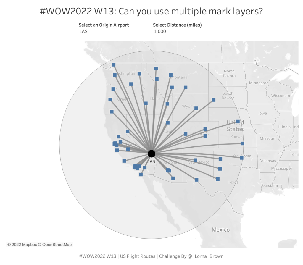
Introduction This week I hone in on majority of those spatial calculations within Tableau. I love the flexibility that Mark Layers allows us to have. Prior to Tableau 2020.4 maps could only have 2 layers and creating this hub and spoke style map would require some serious data preparation. This workout requires 6 calculations. Click […]
#WOW2022 W13: Can you use multiple Mark Layers? Read More »
Tableau, Workout Wednesday