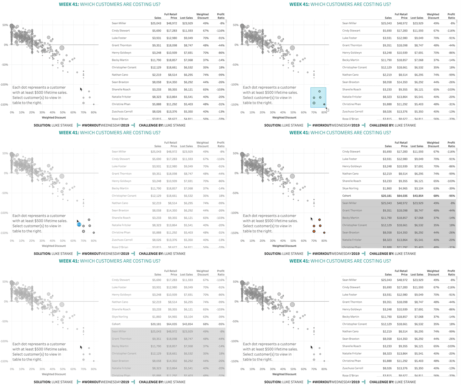
Once again, this week comes from a real life challenge. This real-life scenario involves a scatterplot of customers and a long, long table. The first requirement was to keep all the customers in the list, but also highlight those customers. After a round of feedback our stakeholder decided they wanted the selected customers to “surface to the top”. As soon as this came up, I knew it was a future Workout Wednesday. – LS
Challenge
Click image to view on Tableau Public
Requirements
You will create a scatterplot and a table and have interactivity between the two.
- Format: 1100px by 600px
- Calculations
- Calculate profit ratio. (Total Profit/Total Sales)
- Calculate the full retail price. (Sales/(1-Discount))
- Calculate the total lost sales. (Difference between full price and actual sold price)
- Calculate the weighted discount. (Total lost sales/Full price)
- Scatterplot
- Show a scatter plot of weighted discount (Dollars Saved/Actual Retail Price) and the profit ratio (Total Profit/Total Sales).
- Show one dot per customer.
- Size the dots by total sales.
- Only show customers with $500 or more sales.
- Make the circles 50% opaque and add a border around the circles.
- The base color of the circle should be #A2A2A2.
- Match the tooltip.
- Table
- Show one row per customer.
- Only show customers with $500 dollars in sales or more.
- In the table show: total sales, full retail price, lost sales, weighted discount, and profit ratio.
- Sort customers by lost sales.
- When you select customers from the scatterplot:
- Change the circle color for those customers on the scatterplot.
- Make sure all members remain un-highlighted on the scatterplot.
- Move the selected customer to the top of the text table.
- Keep other customers on the table but have the color change to dark gray (#D4D4D4).
- Show a totals below the selected cohort on the table. Make sure the font is bold for the totals.
- When you deselect make sure the table resets.
Dataset
This week uses the superstore dataset for Tableau 2019.1. You can get it here at data.world
Share
After you finish your workout, share on Twitter using the hashtag #WorkoutWednesday2019 and tag @AnnUJackson, @LukeStanke, @lorna_eden, and @curtisharris_!
Track your progress
Also, don’t forget to track your progress using this Workout Wednesday form.
Attribute & Tag
When you publish your solution on Tableau Public make sure to take the time and include a link to the original inspiration. Don’t forget to add the hashtag #WorkoutWednesday2019, as well!


Hi Luke – I have a question. When I click on Sharelle Roach in the scatter plot (lower right ~70% weighted discount), the tooltip says $2,550 sales, 70% discount and -133% profit ratio. The numbers are different from the table which says $3,233 sales, 65% discount and -103% profit ratio. Should it be the same?
Thank You,
Guan
Hi Luke,
this was interesting!
My sgot: https://tabsoft.co/2INaVuk