Introduction
Jami Delagrange is responsible for this week’s Workout Wednesday Challenge. Here are all the details in Jami’s own words:
Similar to Ann’s experience with the Clustered Histogram (last week’s challenge), I had an idea recently where I knew how to do the individual parts and wasn’t sure how to put them together. I knew how to make a gantt chart based on session duration in minutes, but how could I put that into a vertical bar chart? That’s where it all started in my mind.
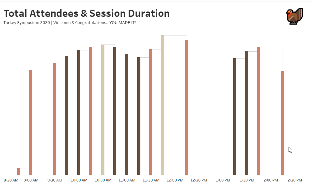
Can you create a variable width bar chart with time? I tried to think of a better way to describe what’s going on here, but I wanted a simple way to show the total attendees for each session vertically and the length of the session horizontally.
The data has been adapted from an all-day virtual event, but instead of humans attending a conference.. we have turkeys attending a symposium. This is my favorite week of the year, so I had some fun creating a themed dataset! 🦃
Requirements
- Dashboard Size: 1000 px by 600 px
- # of Sheets – 1
- Create a chart showing
- Total Attendees per Session
- Session Duration
- Color based on Location
- Live (#cd806a)
- Recording (#664e3c)
- Break (#d6c8aa)
Match formatting of tooltips, colors, and headers.
Dataset
This week uses a specially adapted data set, Turkey Symposium 2020
Direct hyper download Google Drive
Direct CSV download Google Drive
Download via data.world
Attribute
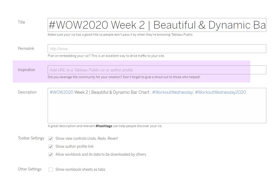
When you publish your solution on Tableau Public make sure to take the time and include a link to the original inspiration. Also include the hashtag #WOW2020 in your description to make it searchable!

Share
After you finish your workout, share on Twitter using the hashtag #WOW2020 and tag @JamiDelagrange, @AnnUJackson, @LukeStanke, @_Lorna_Brown and @HipsterVizNinja

Hi , Hyper files can not be opened with Tableau public, can you please post the excel file with data as well? thanks
Thank you for letting me know. Post has been updated with CSV, here’s the direct link as well: https://drive.google.com/file/d/1IKKUNnJ-mErMibTKcpJEJbcZl53yA7qk/view?usp=sharing
Hi Ann,
here my attempt. Just made a little improvement by creating a custom date to avoid drill down and roll up on the time axis 🙂
https://public.tableau.com/views/WOW2020WEEK48/WOW2020WEEK48?:language=en-GB&:display_count=y&publish=yes&:origin=viz_share_link
The above is basically 2 bar charts plotting the time an event happened (on the x-axis) against the number of turkeys attending the event (on the y-axis). One bar chart is coloured based on the location, the other is a white bar which has a width based on the duration of the event. The first bar chart we need is very simple, plotting Start Time against # Turkeys, coloured by Location.