Introduction
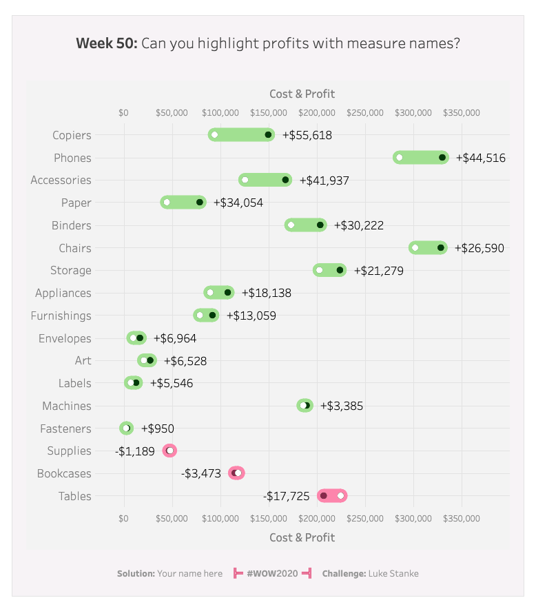
This week we are throwing it back to using measure names and measure values. There are two levels to this challenge:
Level 1
Showing the visualization as is, but without the circles around the white dots in each line
Level 2
Adding a ring around the white dots on the viz.
There is no need for manipulating your data in any way–just using measure values and measure names.
Difficulty: 5/10
The three hardest parts will be:
- getting your dots to be the correct color
- aligning your labels correctly (because of the dots)
- Adding a horizontal grid line for sub-categories
Hint: Remember that you can assign only a single color to each measure of Measure Names.
Requirements
- Dashboard Size: 800px by 900px
- Create a dot plot showing total sales and cost (sales minus profit) by Sub-Category
- Create a dot plot of sales and cost (sales minus profit) by Sub-Category
- Color the cost dots white
- If a sub-category is profitable color the dots dark green (#004500)
- If a sub-category is not profitable color the dots dark red (#8F2D56)
- Optional: Create an outline around the white dots
- Plot a line between the cost and the sales
- If sales is greater than cost (profitable) color the line green (#B0E498)
- If the sales is less than the cost (not profitable) color the line pink (#F690B5)
- Add the total profit or loss for each sub-category
- Add a 0 line on rows so your audience can easily track the values for each sub-category.
- Match Formatting
- Padding on visualization
- 20px inner padding
- 20px outer padding
- Font styling on axes
- Font styling of labels
- Grid line styling
- Padding on visualization
Dataset
This week uses the superstore dataset for Tableau 2020.3. You can get it here at data.world
Attribute
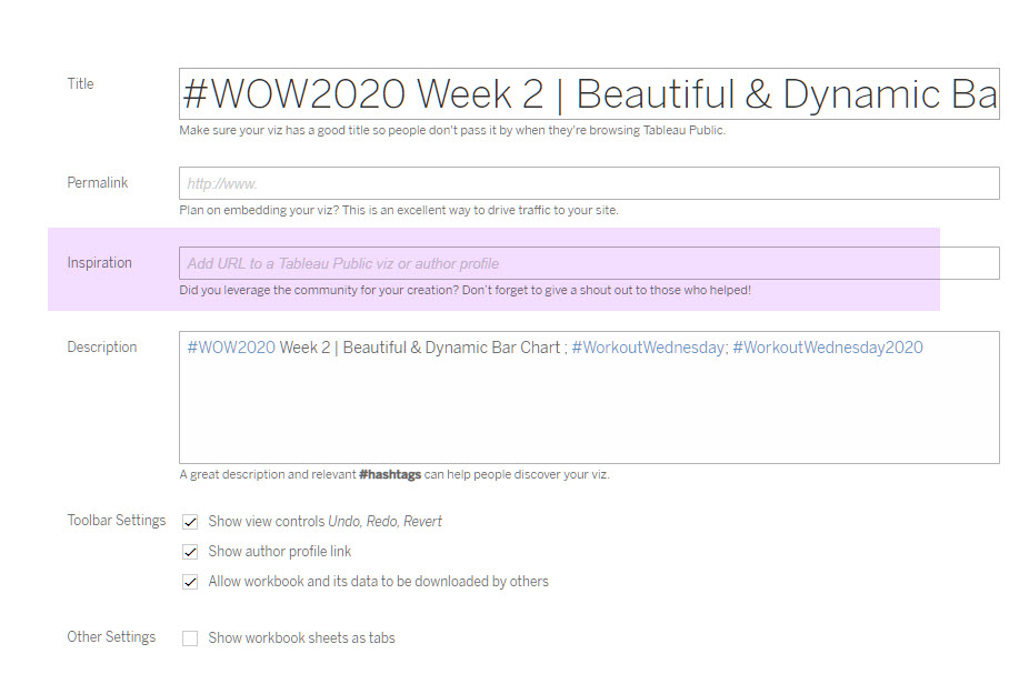
When you publish your solution on Tableau Public make sure to take the time and include a link to the original inspiration. Also include the hashtag #WOW2020 in your description to make it searchable!

Share
After you finish your workout, share on Twitter using the hashtag #WOW2020 and tag @AnnUJackson, @LukeStanke, @_Lorna_Brown and @HipsterVizNinja

Hey, Luke. I would really love to recreate the above but I’m unable to do so. I’m very new to Tableau and would really appreciate if I could get further help with it. Some similar tutorial or editable file would do the work or anything else which you think can provide me with more clarity would be really appreciated.
Thank you
Vani
Hi Everybody,
maybe it is because I am new to the whole Tableau stuff, but something weird is happening.
Im using Tableau Public, and I setup all the colors correctly, but when I publish to Tableau Public, somehow a random Palette is assigned for the circles.
What am I missing?
Thanks
Hello, Can anyone upload the solution?