Introduction
This week we are going to do two things:
- look at alternative for the most common scatterplot I see in Tableau.
- use a very uncommon unsynchronized dual axis chart.
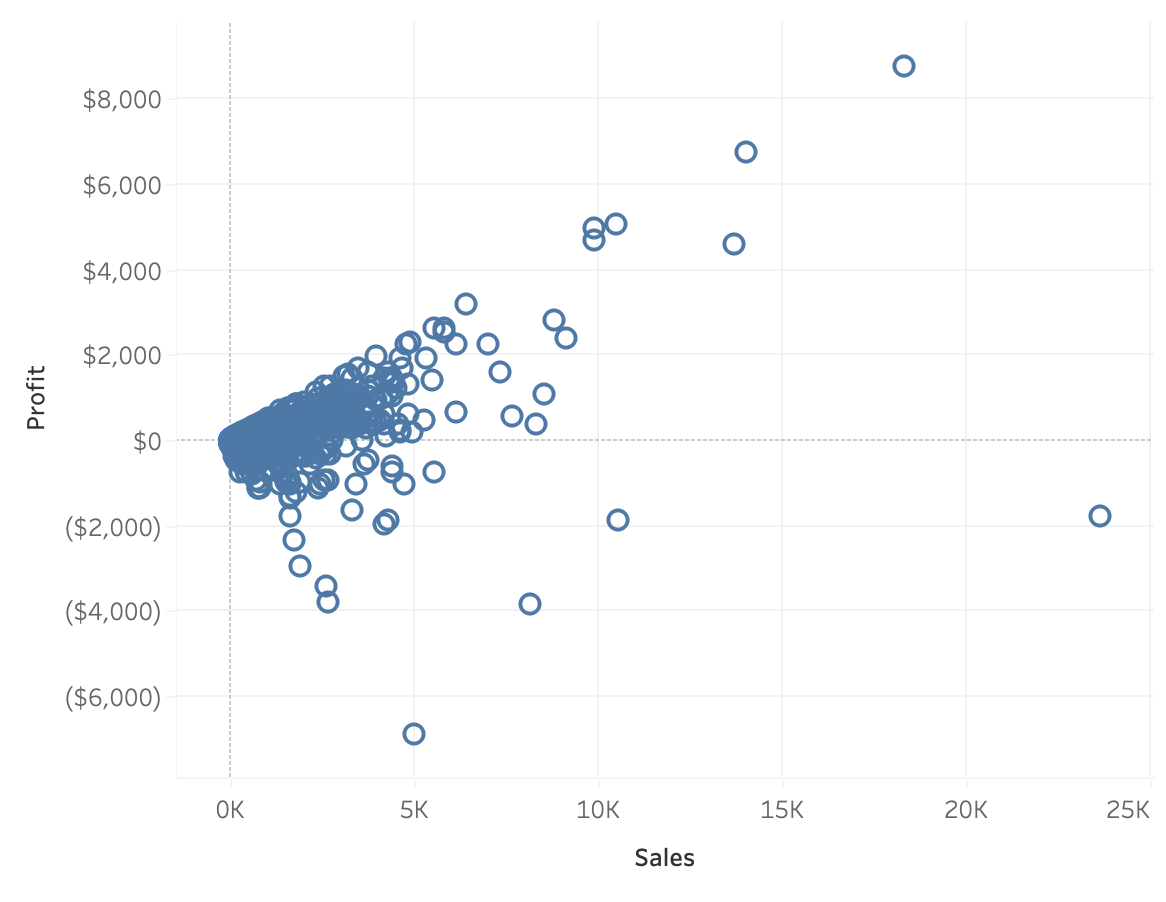
First, the chart I always run into is this scatterplot of total sales and total profit by order.

While we can see which orders were profitable and which were not, the plot doesn’t show a pattern. And if I’m using a scatterplot, I want to see a pattern.
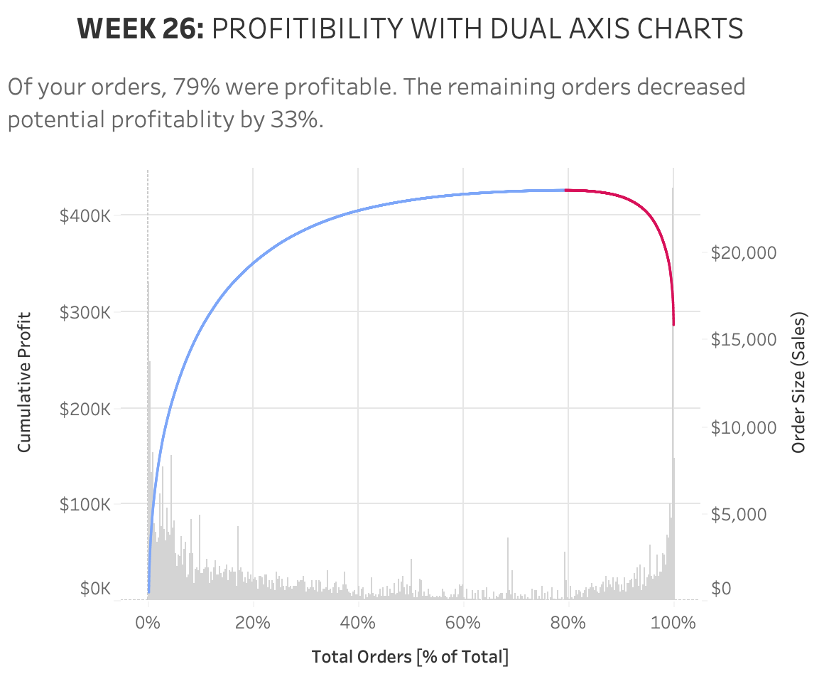
Instead of using this plot I suggest using a pareto/bar dual-axis chart, The chart still shows profit and sales by order–but now we have greater insight to which orders are driving profitability. By layering in the bar chart it adds context about order size relative to all other orders.
Requirements
- Dashboard Size: 600px by 500 px
- Set the x-axis to be percent of total orders, sorted descending by profit.
- Create a pareto showing cumulative profit by order
- Use a line chart
- Add color to show where orders go from profitable to not profitable
- Be sure to highlight not profitable orders in red.
- Create a bar chart showing total sales by order
- The bar widths should be equal to one order
- Set the color to medium gray
- Match the formatting
Dataset
This week uses the superstore dataset for Tableau 2020.1. You can get it here at data.world

can you make the tableau workbook available for download?