Introduction
Like a fine pinot grigio, I really enjoy a good box-and-whisker plot. There is so much good stat stuff in one place like the min/max, median, top/bottom performers, and outliers in the data set. I have found, however, that they are rarely used and some business end users find them hard to read.
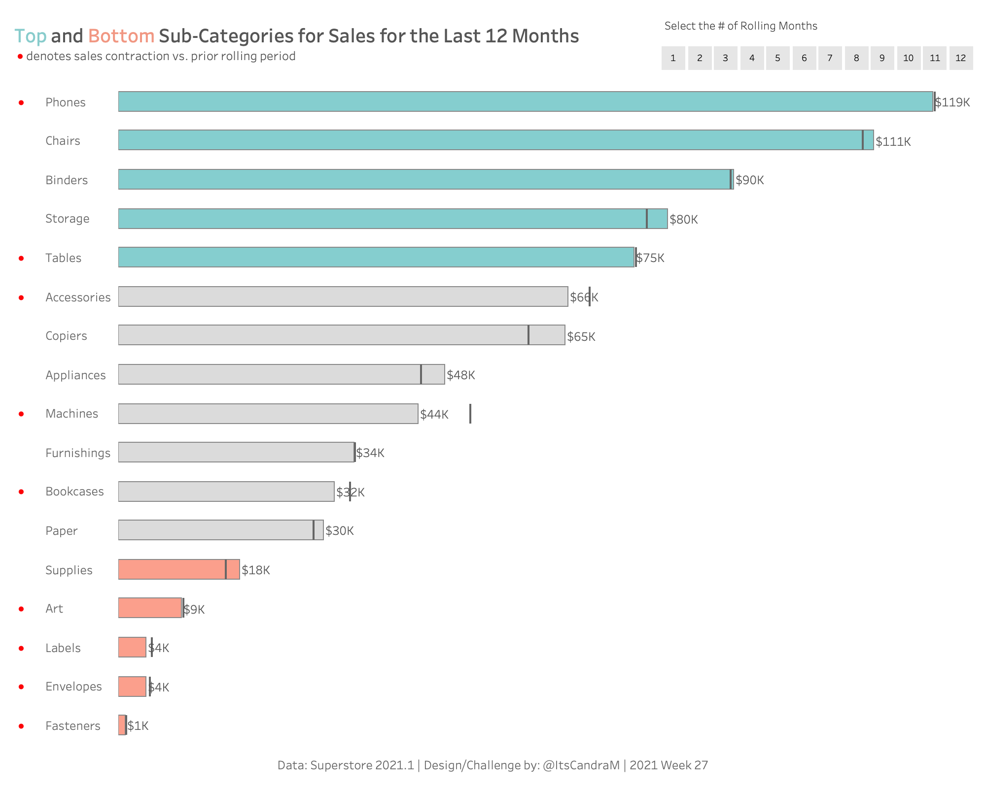
This week’s challenge isn’t about how to make a box and whisker plot chart easier to read – it’s about how do we incorporate the insightful parts of the box and whisker chart into the Honda Accord of all charts: the bar chart? Meaning, we do away with arbitrarily created Top N lines in the sand and we use good old fashioned statistics to identify our top/bottom performers.
Requirements
- No sets
- No LODs except to find the max date (hint)
- No reference lines for the prior rolling period
- Parameter action for the # of rolling months. User must be able to change the number of months included in the rolling months with a single click (no type-in/slider/radio button/drop-down parameters)
- Sub-Category Color Buckets:
- Interquartile range
- At or below 25th percentile
- At or above 75th percentile
- A line should signify the previous rolling N value for sales
- ‘●’ should be added to the view to easily identify the sub-categories that have experienced sales contraction
- Same formatting
- Dashboard size: 1000 X 800
- Sheets: 2
Dataset
This week uses the superstore dataset for Tableau 2021.1. You can get it here at data.world
Attribute
When you publish your solution on Tableau Public make sure to take the time and include a link to the original inspiration. Also include the hashtag #WOW2021 in your description to make it searchable!

Share
After you finish your workout, share on Twitter using the hashtag #WOW2021 and tag @AnnUJackson, @ItsCandraM, @LukeStanke, @_Lorna_Brown and @HipsterVizNinja
