Introduction
This week
is my debut challenge as a Workout Wednesday coach and it’s safe to say that
I’m looking forward to the year ahead! All the coaches are teaming up this
month to bring together an interactive dashboard made up of challenging charts.
Over the
next few weeks, each coach will contribute one piece of the puzzle and
eventually you will see how they all fit together. We know life gets busy, so
don’t worry if you miss a week – we will post the previous week’s workbook so
you can pick things up and follow along however you choose.
For this
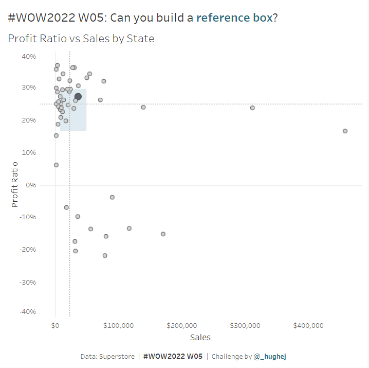
first week, I challenge you to create a scatter chart…with a twist. This
scatter chart combines the principles of a box plot to create a “reference box”.
Requirements
- Dashboard Size: 650 x 650px
- 1 sheet
- Create a scatter chart showing the Profit Ratio against Sales for each State
- Create a ‘reference box’ that covers the area between the 25th Percentile and the 75th Percentile for both Sales and Profit Ratio (box colour: #f2f9f9)
- Add reference lines for the medians
- Allow users to click on a State and highlight it with a different colour and slightly larger size.
- Selected state colour: #5c6068
- Other states colour: #d3d3d3
- Bonus: Make sure the Profit Ratio axis is symmetrical (ie: 0% is in the middle of the axis) and dynamic, such that if States were to be filtered out it would remain symmetrical.
Dataset
This week uses the Superstore dataset for Tableau 2021. You can find it here on Data.World
Attribute
When you publish your solution on Tableau Public make sure to take the time and include a link to the original inspiration. Also include the hashtag #WOW2022 in your description to make it searchable!

Share
After you finish your workout, share on Twitter using the hashtag #WOW2022 and tag @LukeStanke, @_Lorna_Brown, @HipsterVizNinja, @_hughej, and @YetterDataViz
